
Optimizing Mobile POS for Faster, Error-Free Transactions
Launched in 2024, D-store by Alipay provides digital solutions for Southeast Asia’s food and beverage (F&B) industry. Its tablet POS system helps medium and large businesses manage orders, payments, and sales, while integrating with platforms like Grab and Foodpanda. Major brands like Koufu and Coolblog rely on it to streamline operations.
To support small-to-medium merchants, D-store planned to launch a mobile POS system in Q2 2024, offering a more flexible, cost-efficient solution. This project was developed concurrently with new mobile POS features, requiring enhancements from the tablet POS to be adapted while managing the simultaneous rollout of new capabilities. However, adapting the tablet POS to mobile posed challenges—workflows were not optimized for smaller screens, causing disjointed user experiences.
This case study focuses on improving two key areas—check actions and payment processing—to make the mobile POS faster, more intuitive, and easier to use for cashiers with minimal training.
Problem

1
Non-optimized Tablet POS Experience for Mobile Devices

1
Relevant modules are placed in different tabs, creating a disjointed user experience. This complexity causes cashiers to rely on supervisors for assistance, slowing down operations.
2
Inefficient Payment Method Optimization
1
D-store supports both cash and digital payments but applies a one-size-fits-all approach. In Southeast Asia, where cash is still common, this leads to errors, especially among part-time cashiers unfamiliar with the system.
Problem statement
How might we create a more intuitive mobile POS experience that reduces training time, minimizes errors, and aligns with the cashier's workflow?
Project scope
This initiative was conducted concurrently with the development of new mobile-exclusive ordering features, meaning enhancements to the tablet POS had to fit within same timeline. We focused on two critical areas with high touchpoints for daily cashier operations:

Actions tab
A dedicated section where cashiers can modify and manage active orders. It includes essential functions like voiding items, applying discounts, and adjusting quantities. This tab is crucial for handling order changes but required streamlining to reduce unnecessary navigation.
Payment Method Selection and Processing
This flow governs how cashiers select and complete different payment types (e.g., cash, card, or QR payments). It needed optimization to address the inefficiencies of handling cash and digital payments through a one-size-fits-all process.
Challenges
1
Concurrent Design for New Features
1
Balancing enhancement efforts with the development of new mobile-exclusive features required constant context switching and prioritization.
2
Managing Stakeholders
1
With initial resources focused on new features, securing buy-in from the product manager and lead designer for these enhancements required pitching and lobbying.
3
Lack of UX Research
1
Limited time and resources prevented extensive UX research. We relied on competitor analysis and post-launch testing to validate design decisions.
How it works today
Merchant-Specific Solutions (e.g., McDonald’s, KFC) – Custom-built, optimized for fixed menus but lack adaptability for diverse merchants.
1
Check Actions
1
Check actions are functionalities to modify and manage active orders. It includes essential functions like voiding items, applying discounts, and adjusting quantities. In 50% of transactions, cashiers need to modify orders. The current flow is as per illustrated below.
As seen in the user flow, navigating to a separate tab disrupts the workflow and makes it harder to apply actions to a specific check. This increases cognitive load by requiring users to switch contexts between tabs.
For new or part-time cashiers, the added steps create confusion and increase the risk of errors, as the action is disconnected from the check being modified. This slows down transaction times and often requires additional support from supervisors.
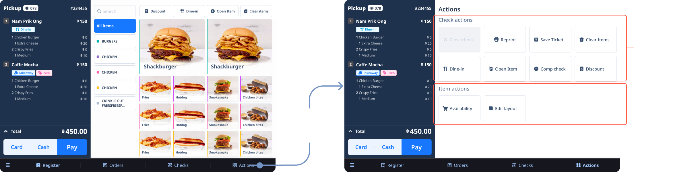
Current tablet user flow of check actions
2
Payment Method Selection and Processing
1
The payment process today is identical for cash and digital payments as per illustrated below. The split between cash and digital payments for Singapore is 40:60, where consumers usually settle their digital payments in a single transaction.
This adds unnecessary steps for digital payments, where the amount is already fixed, leading to inefficiencies. For cash payments, inputting the received amount is essential to calculate change, but for digital payments, requiring manual input adds friction to the process. This slows down checkout times and increases the likelihood of input errors, especially during peak hours when speed is critical. The one-size-fits-all approach does not cater to the specific needs of each payment method, leading to a suboptimal user experience.
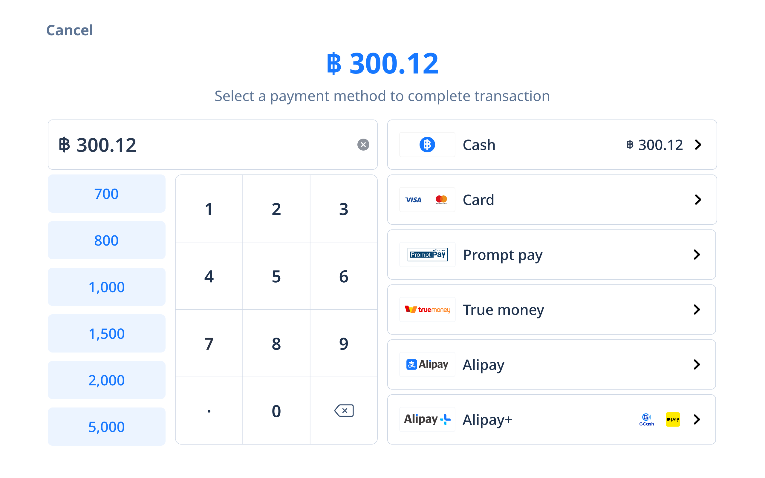
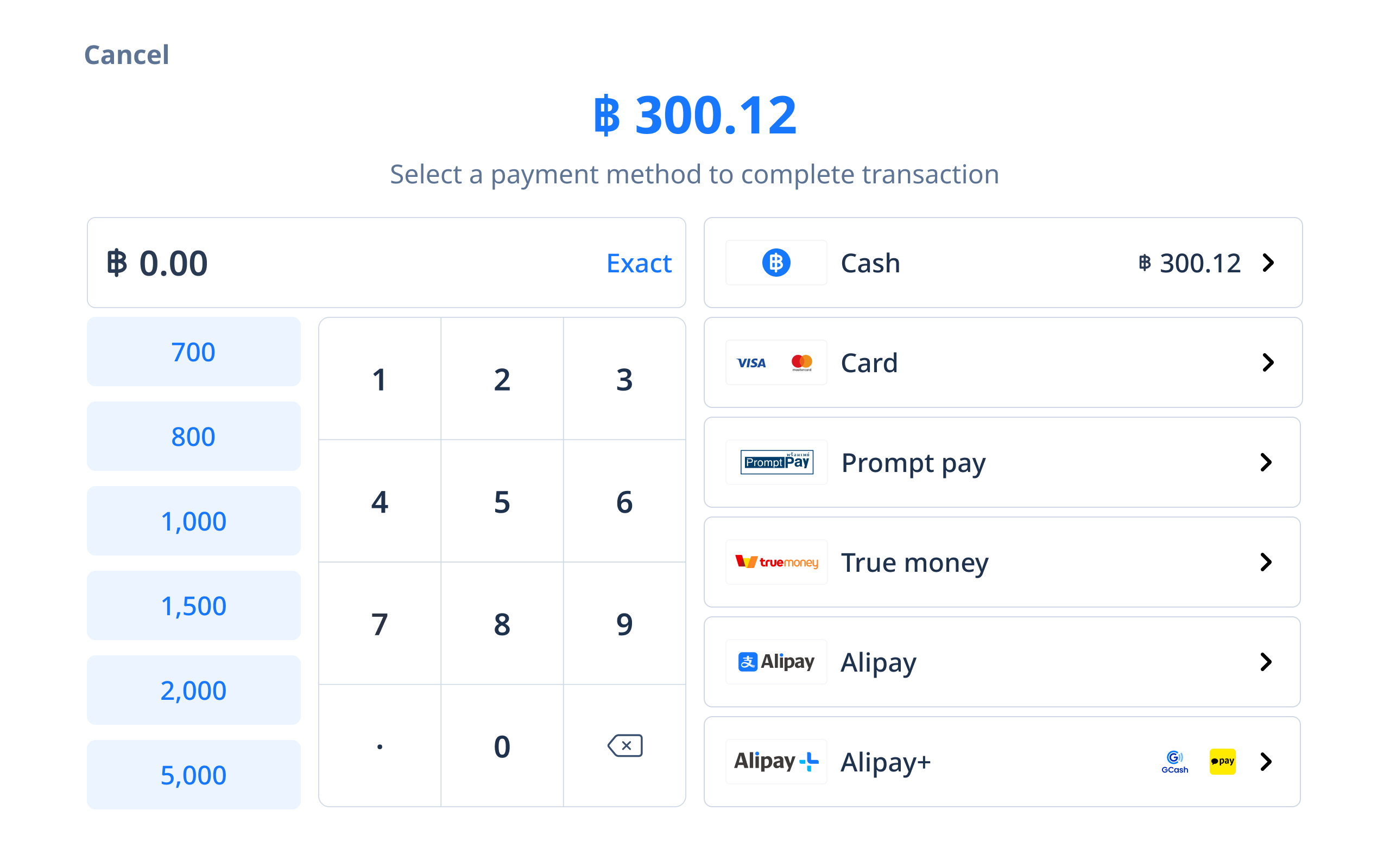
Current tablet user flow of payment selection and processing
Competitor research

1
Check actions
1
Competitor analysis (Square, Loyverse) revealed that all competitors place high-frequency check actions directly within the check interface.
Low-frequency actions are placed in secondary menus, ensuring that the most common tasks remain accessible without navigating away from the primary screen. This pattern reduces friction and aligns with industry standards for faster, error-free modifications.
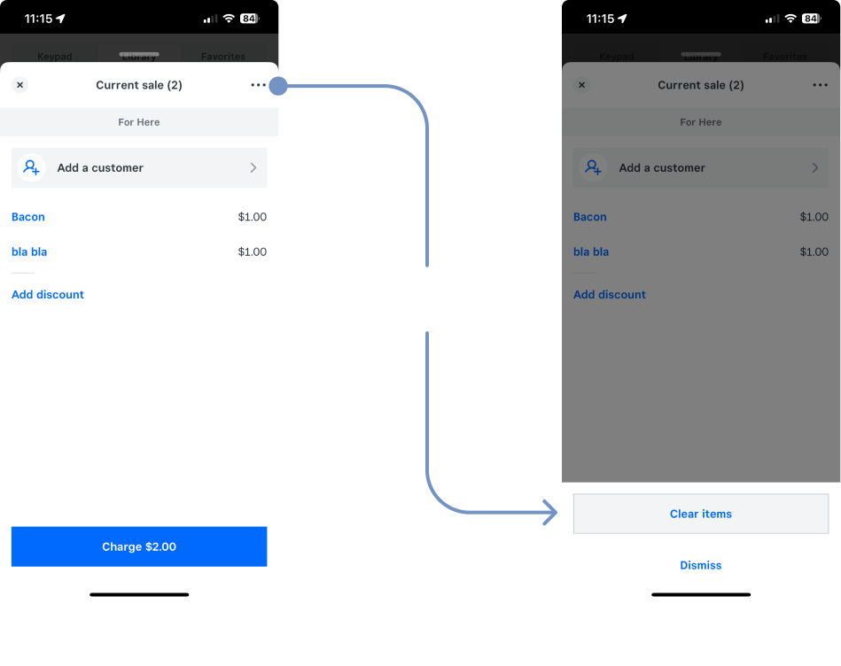
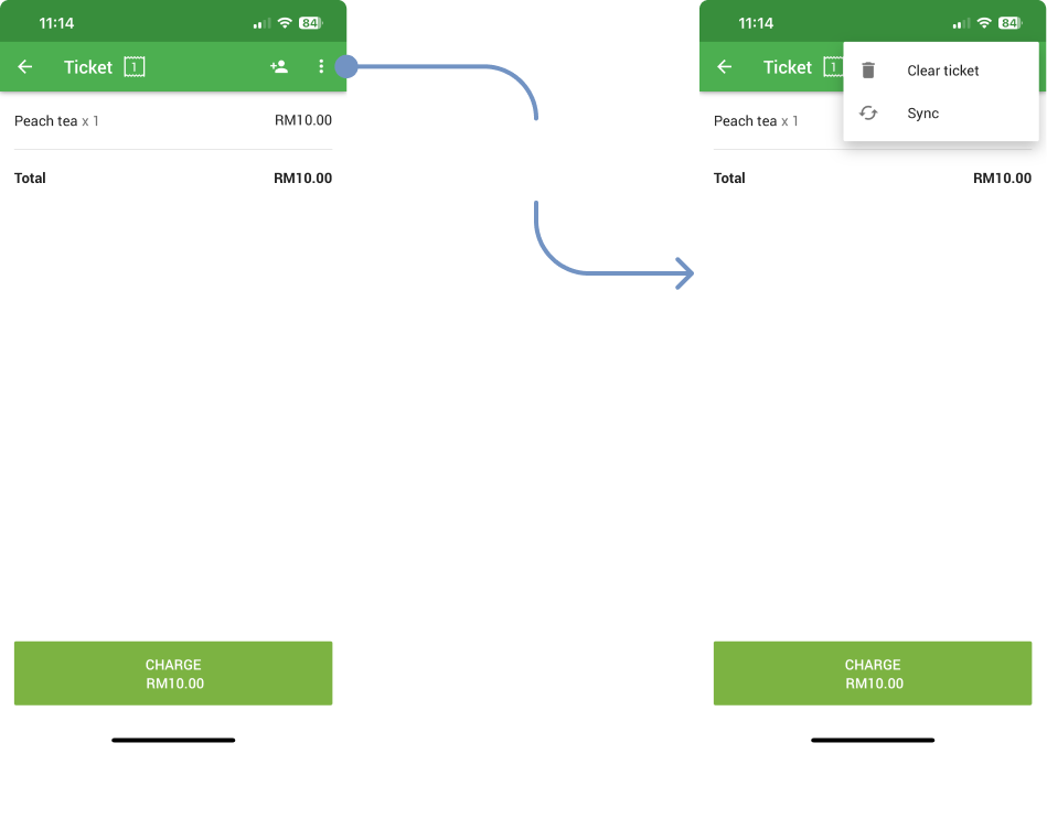
Square’s and Loyverse’s check action user flow
2
Payment Method and Processing
1
Competitors streamline payments by allowing users to select the payment method first. For digital payments, they bypass manual amount input, recognizing that exact amounts are already calculated. Our updated flow reflects this best practice while accommodating SEA-specific needs where cash handling remains prevalent.
This hybrid approach optimizes speed for digital payments while maintaining flexibility for cash transactions.
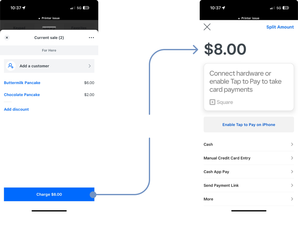
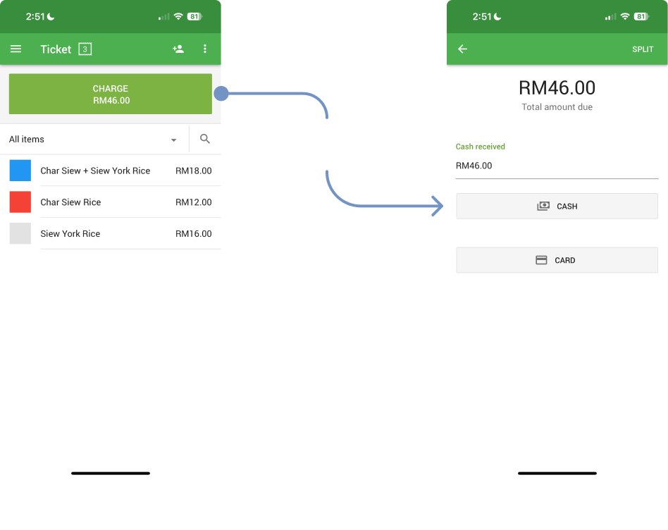
Square’s and Loyverse’s payment processing user flow
Design approach
1
Actions tab -> Check actions
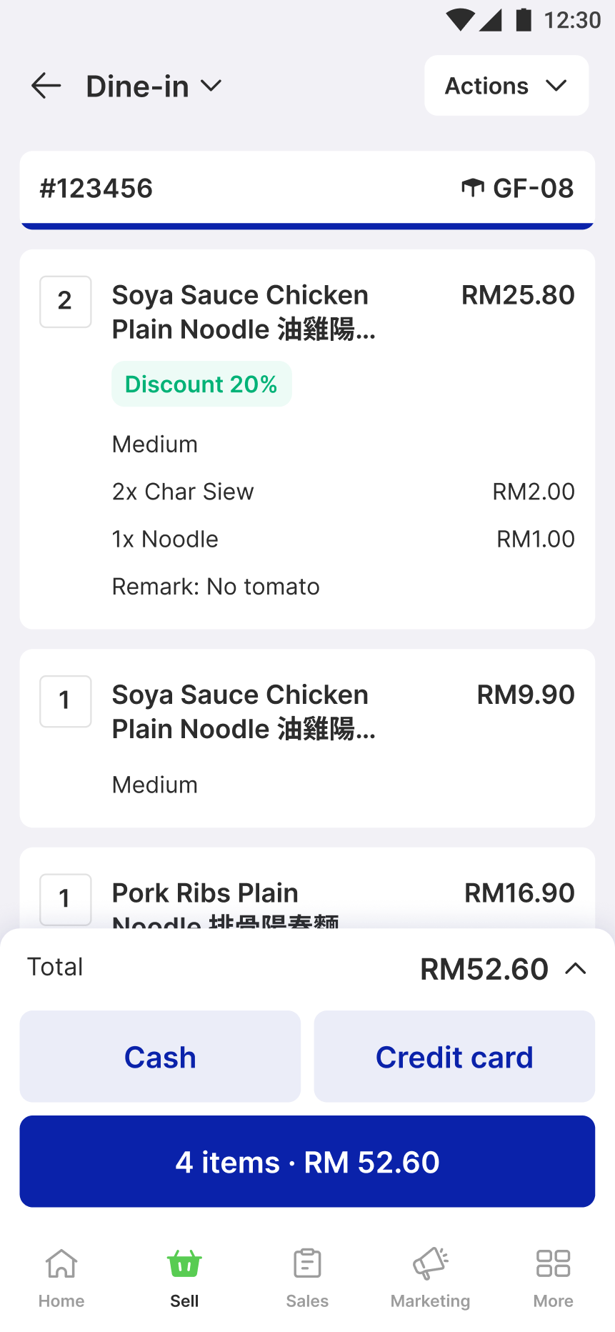
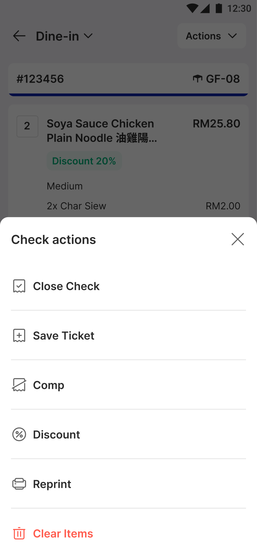
We integrated check actions within the same interface to improve relevance and reduce navigation friction. This allows cashiers to apply modifications directly to a selected check without switching tabs, making the process faster and more intuitive.
Low-frequency actions (e.g., item availability) were moved to a secondary menu to declutter the primary interface, ensuring the most-used functions are easily accessible.
This reduces context switching and aligns with cashier mental models, making it easier to perform modifications without additional training. By keeping core actions within the same screen, cashiers can focus on their tasks with fewer interruptions, leading to faster processing times and fewer errors.
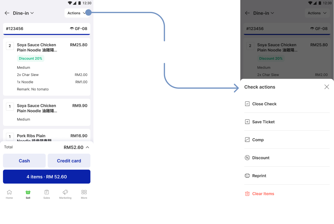
Enhanced check actions for mobile POS
2
Tailored payment method selection & processing
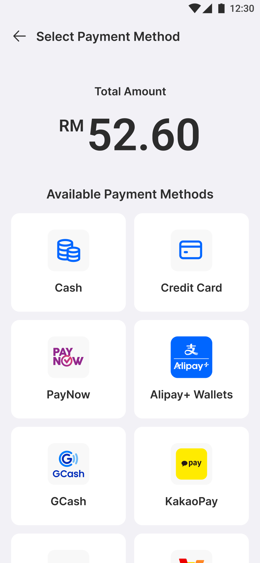
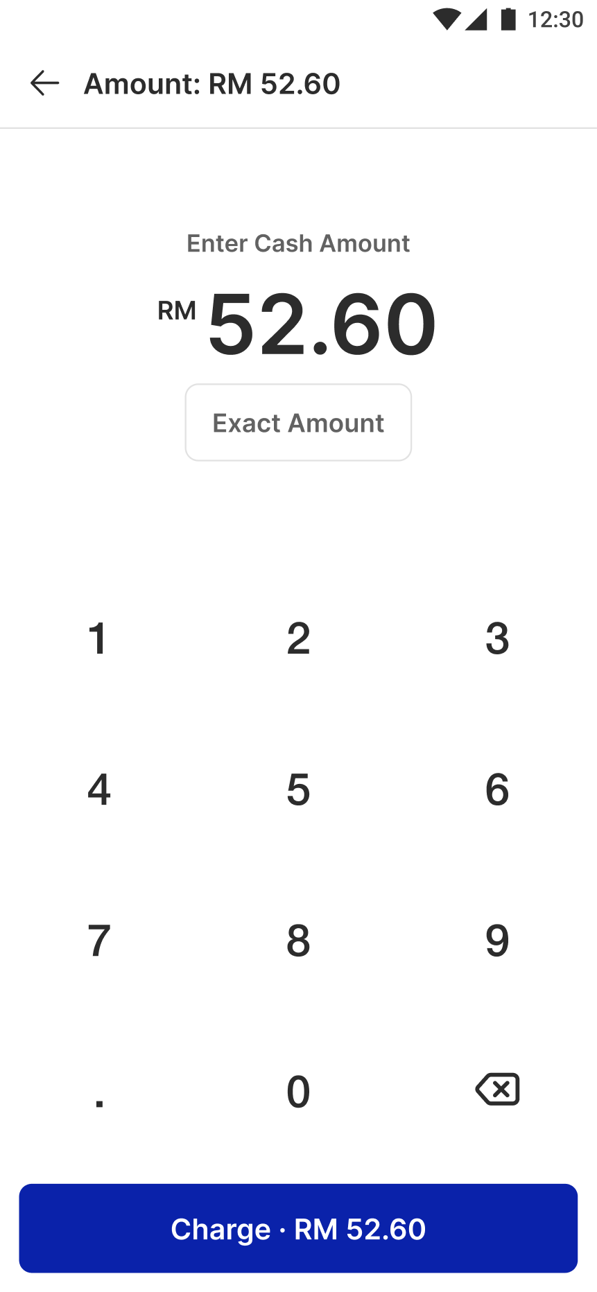
We customized the flow for each payment method to better reflect real-world cashier workflows. Cash payments, which often require manual input, start with an amount input field. For digital payments, where the amount is typically fixed, the system pre-fills the amount to eliminate unnecessary steps.
This tailored approach reflects how cashiers interact with different payment methods. By eliminating the manual input step for digital payments, we reduced friction and improved speed. For cash payments, the flow maintains flexibility for variable amounts while providing shortcuts for common inputs, improving both efficiency and accuracy. This design also aligns with regional payment behaviors, where cash remains prevalent in many Southeast Asian markets.
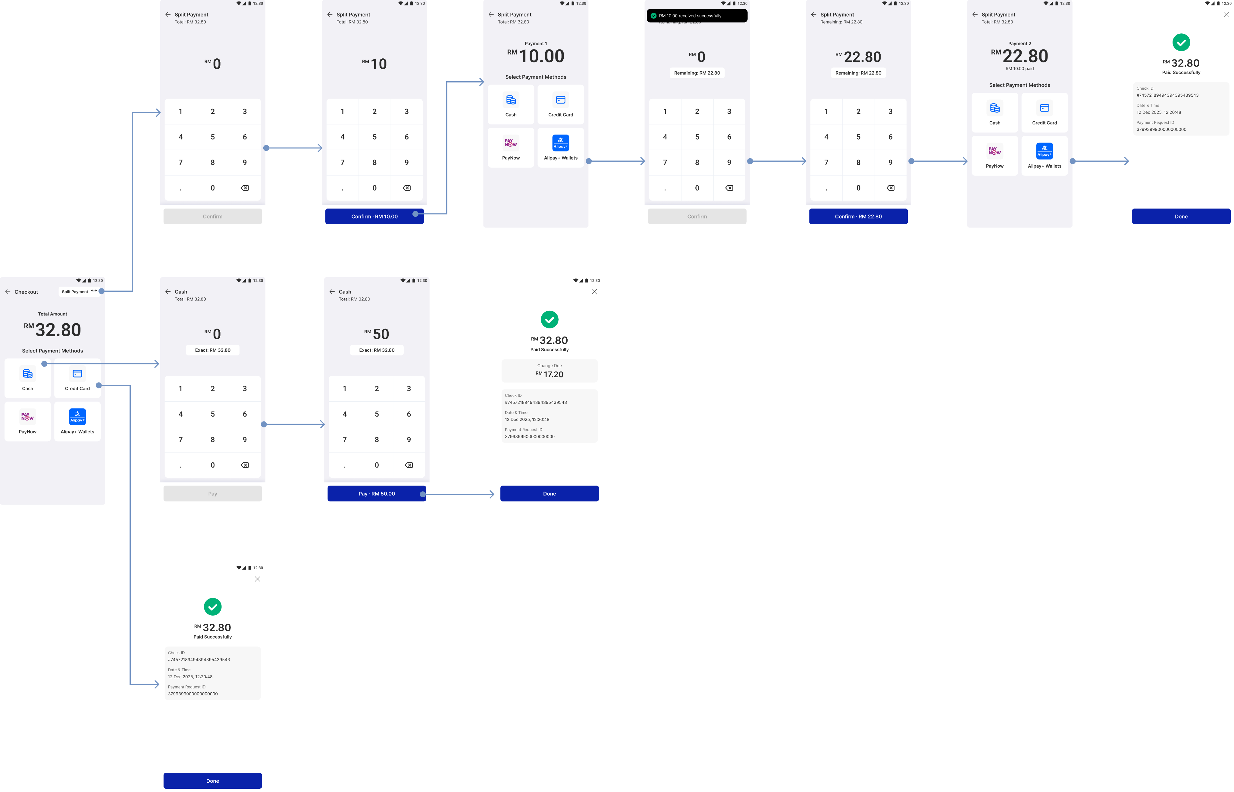
Enhanced payment for mobile POS
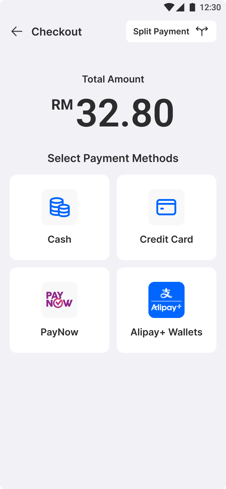
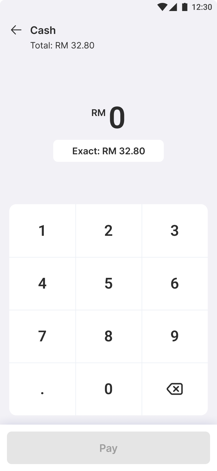
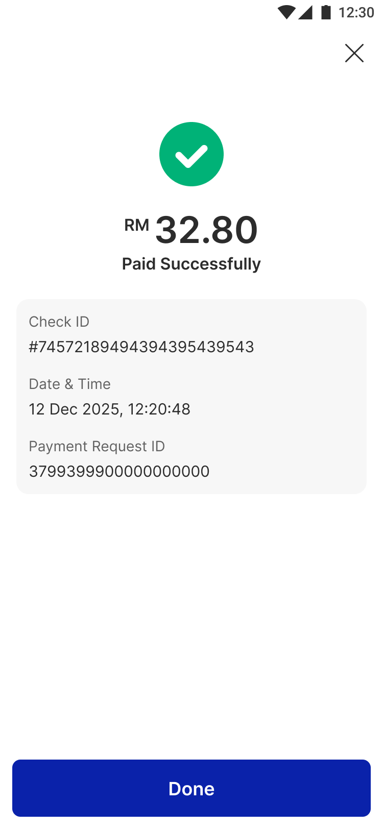
Final design of mobile POS feature enhancement
Key learnings & takeaways
This project reinforced the importance of advocating for user-centered improvements, even when not prioritized. Designing for mobile requires adapting workflows rather than directly porting tablet experiences. While competitor insights were valuable, we learned the importance of localizing solutions to fit the unique payment behaviors in SEA. Lastly, continuous iteration and real-world validation, even through informal methods, are crucial for refining the user experience.
- End, thank you for reading! -