
Designing a self-ordering kiosk for NTUC
Self-ordering kiosks are now a common sight in Singapore’s quick-service restaurants, benefiting both customers and merchants by streamlining the ordering process. Customers enjoy a more efficient experience, while restaurant staff can focus on food preparation and operations.
D-store by Alipay, a digital solutions provider, partnered with NTUC’s Koufu in 2024 to enhance digital operations in F&B. As Koufu sought a self-ordering kiosk provider, they turned to D-store to lead the initiative, aiming for a seamless and scalable solution.
Problem
Despite the availability of self-ordering kiosk providers, common issues persist:

1
Limited menu customization

1
Most providers support only one layer of item modification, leading to clunky workarounds for combos and promotions.
2
Rigid UI Customization
1
Many local providers offer little flexibility in interface design, affecting usability due to constraints in layout, colors, and font sizes.
3
Unintuitive Customer Experience
1
Without human interaction, kiosks must guide users effectively. Many existing solutions fail to provide clear next steps, leaving customers unsure of how to proceed.
Opportunity
How might we design a fully self-sufficient ordering experience while ensuring flexibility for diverse menus?
Project scope
This project focuses on:

Seamless menu discovery
Smooth item selection and ordering
Digital payment processing
Challenges
1
Complex menu structures
1
Our database supports up to 10 levels of modifiers, a customization or adjustment to a standard menu item, for a single item but for a consumer-facing kiosk, we needed to simplify this while accommodating both single and multiple selections, as well as, child modifiers from a parent modifier. As such, we needed to find a consensus point to define the maximum number of modifiers we will allow merchants to set up their modifiers per item that is acceptable for the customer’s perspective.
Spice level
Doneness level
Level 4
Modifier Group
Rare
Medium rare
Medium well
Medium
Well done
Level 5
Modifier
Modifier
Modifier
Modifier
Modifier
Modifier


Curry Katsu Don
Type of meat
Beef
Chicken


Level 1
Items
Level 2
Modifier Group
Level 3
Modifier
Items
Items
No spicy
Mild
Medium
Hot


Modifier
Modifier
Modifier
Modifier
Level 1 - Level 5 D-store Item Structure
2
Minimal Initial Requirements
1
With no predefined requirements from product management, we conducted independent research on common industry flows and user behaviors.
3
New Platform Constraints
1
Previously, we had only designed for mobile and tablet interfaces. Designing for a larger, unfamiliar screen required additional usability research, including in-office testing on a repurposed monitor.
Research
Over two weeks, we observed kiosk usage in Singapore and Kuala Lumpur, supplemented by informal interviews with staff and customers. Key insights included:
Our goals are:
Understand user’s interaction with large devices
Accessibility constraints
Decision making and actions to complete ordering flow
Key learnings:

Overloaded screens slow decision-making.
The top 15% of large screens (>16”) is often ignored.
Clear visuals aid decision-making.
Users explore menu categories even if uninterested.
Kiosks are favored by introverts who prefer self-service.
Kiosk ordering is inherently slower than counter service (3+ minutes vs. 30 seconds).
Market Landscape
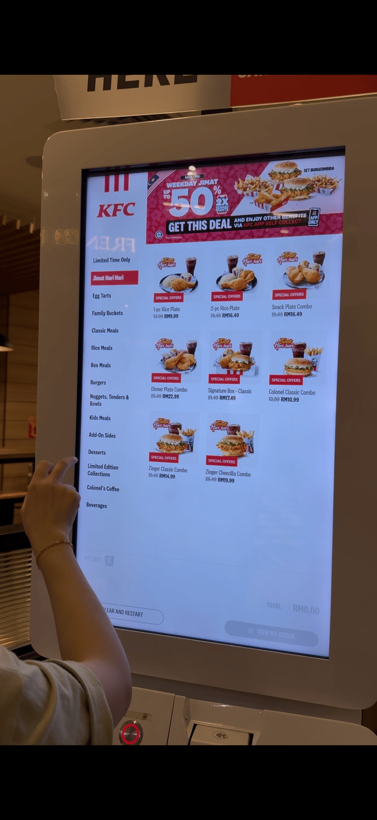
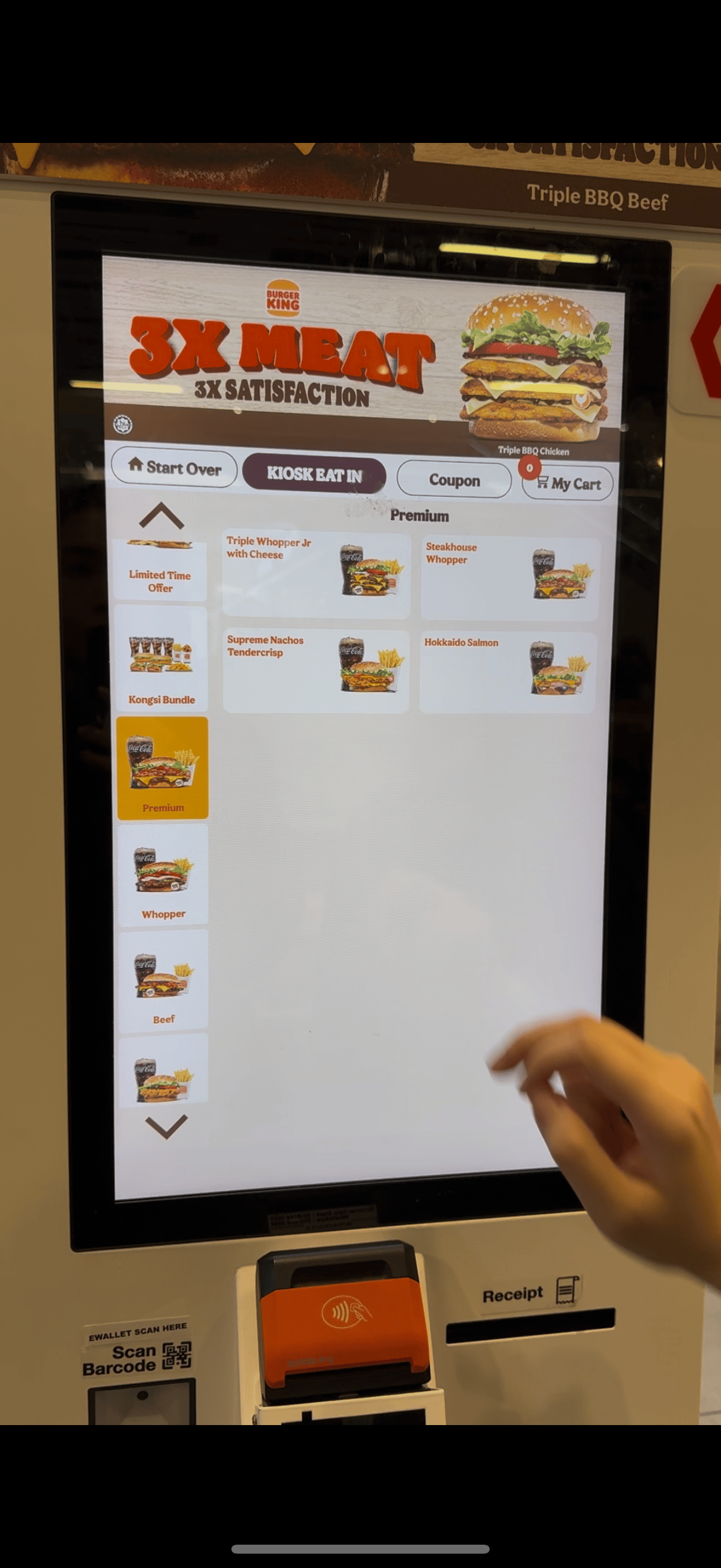
Merchant-Specific Solutions (e.g., McDonald’s, KFC) – Custom-built, optimized for fixed menus but lack adaptability for diverse merchants.
1
Merchant-Specific Solutions (e.g., McDonald’s, KFC)
1
Custom-built, optimized for fixed menus but lack adaptability for diverse merchants.
KFC
Burger king
Mcdonalds
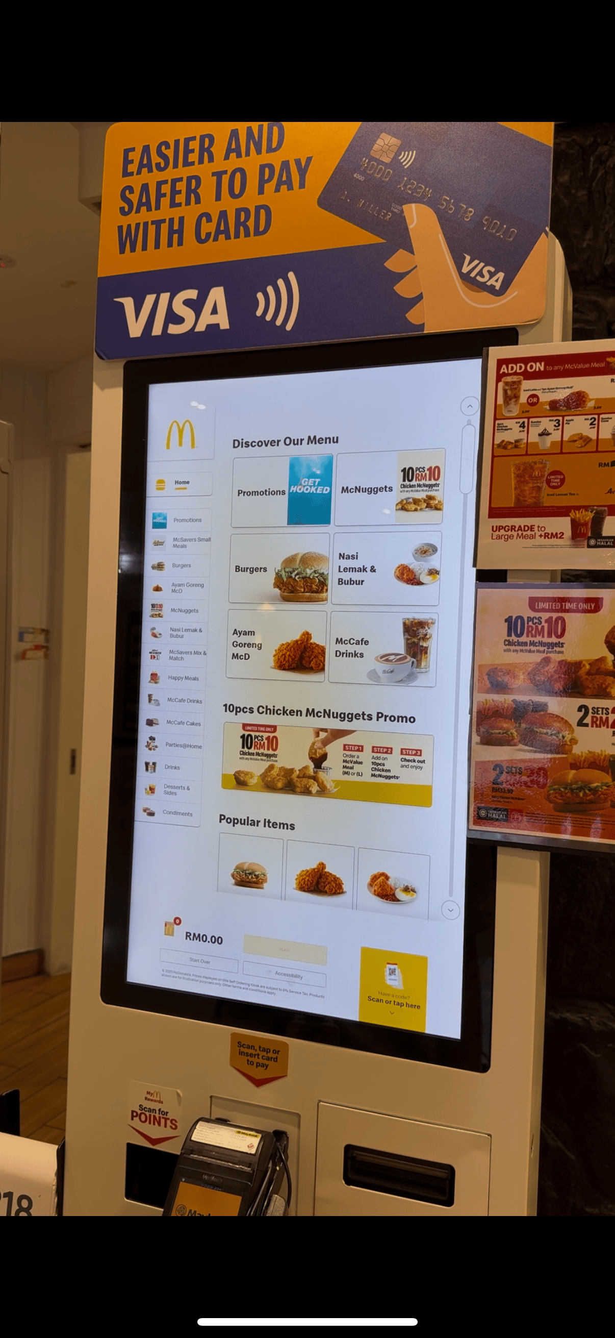
Screenshots of merchant specific kiosk
2
SaaS providers (e.g. Zeoniq)
1
More affordable, but limited in menu structuring and customization, often leading to confusing user experiences.
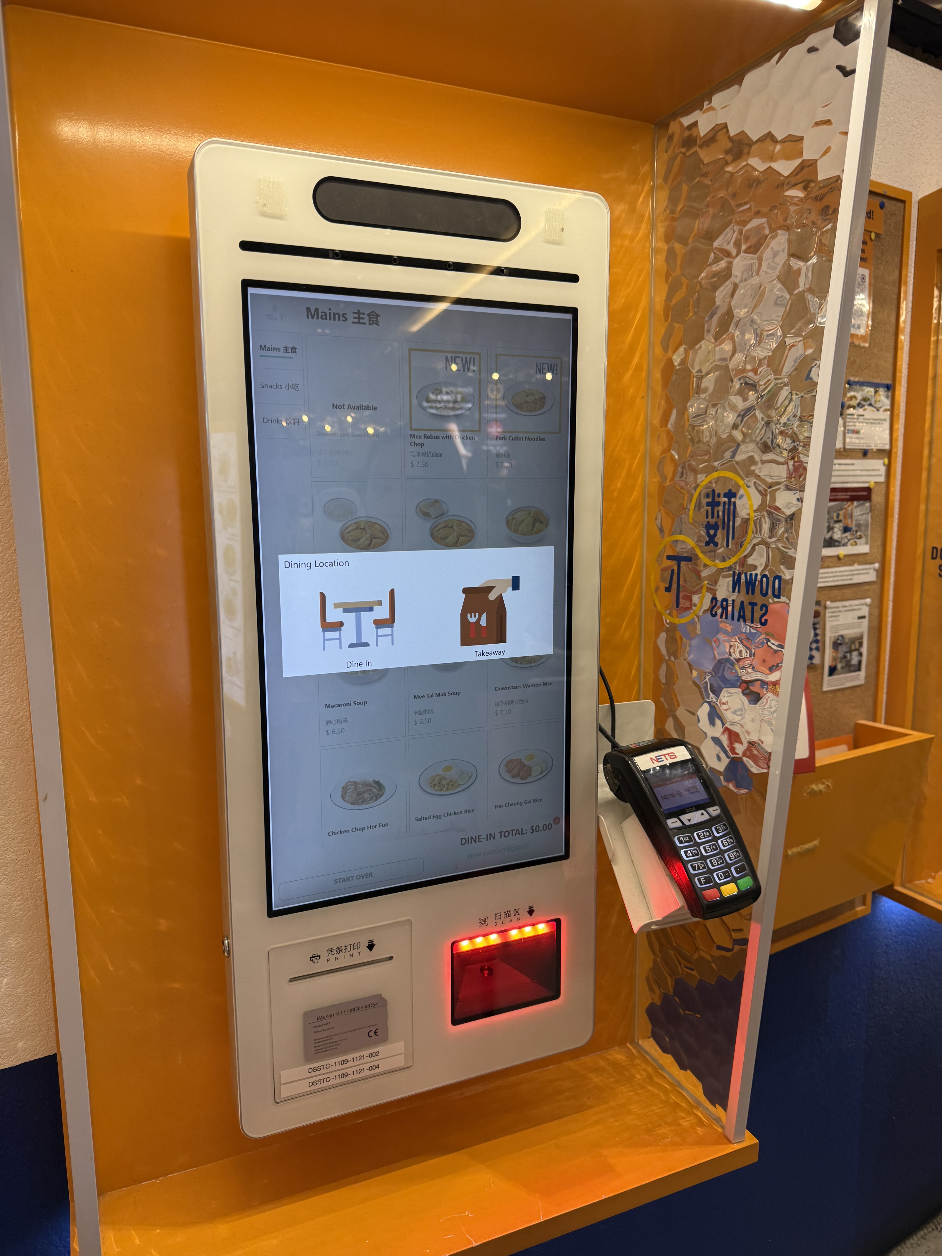
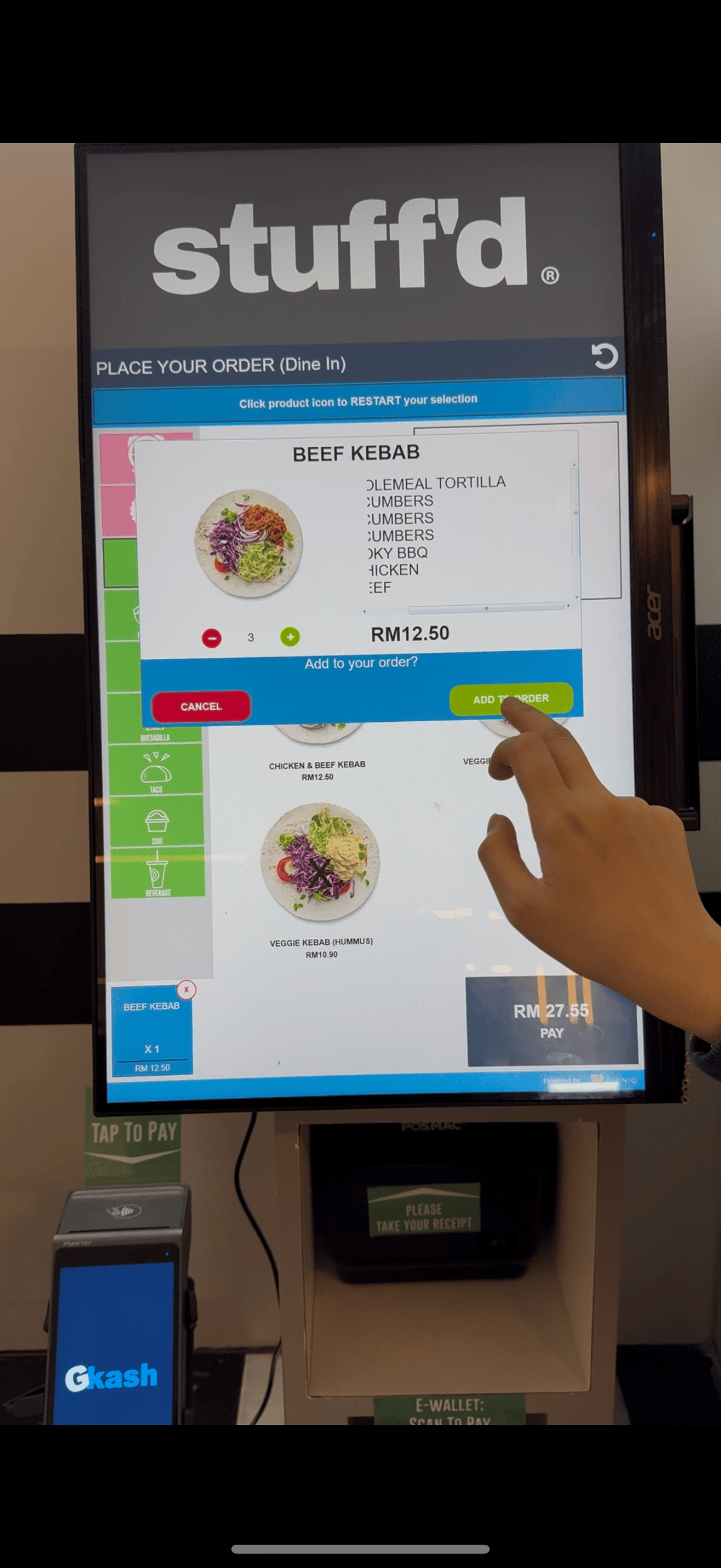
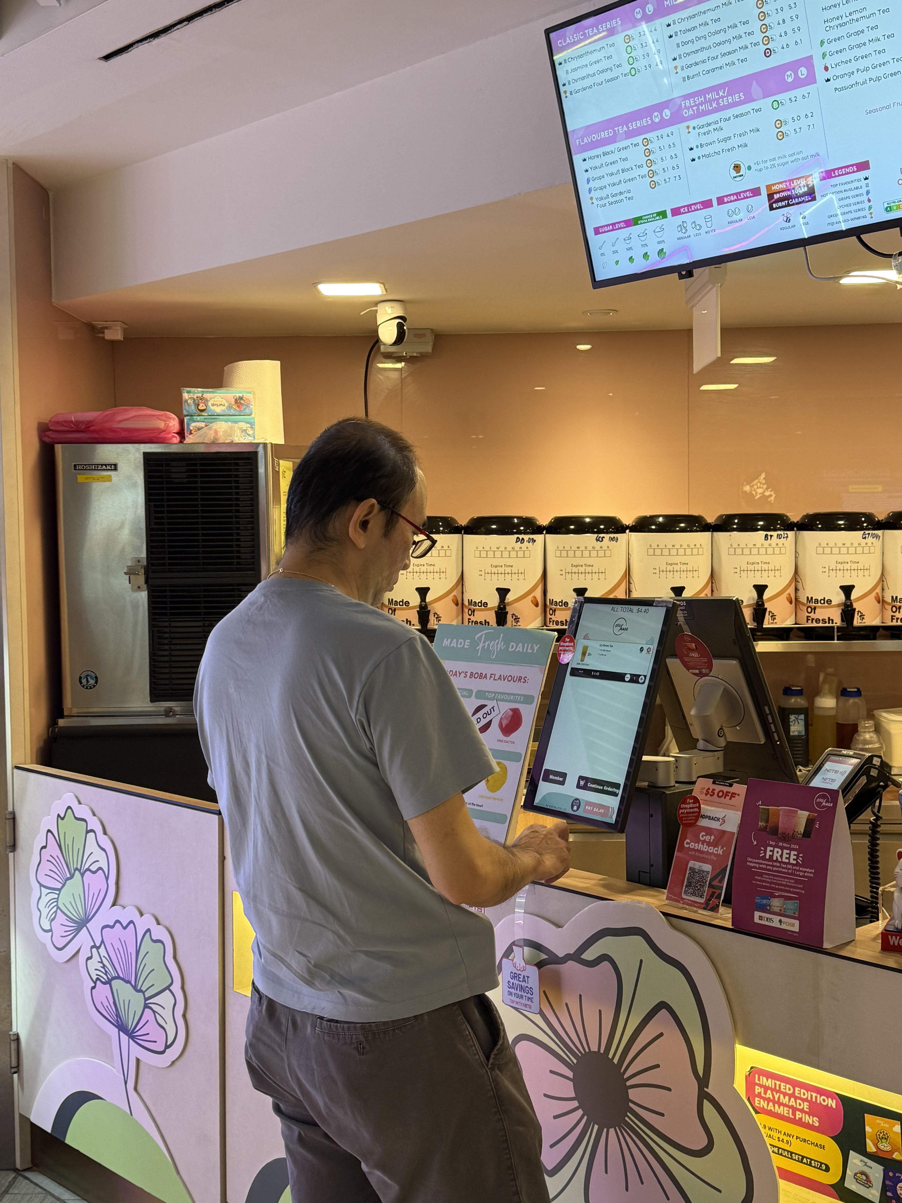
Screens of SaaS providers collected during the field research done
Design approach
To address these gaps, our design centered on three principles:
🧠
Clarity
The interface must be intuitive, with clear navigation and informative text.
🌞
High Visibility
Strong contrast, clear buttons, and accessible layouts for easy interaction.
🏢
Scalability
Modular design to accommodate different merchant needs without excessive customization.
Key Design Decisions
Throughout the design process, we focused on reducing friction while ensuring users could independently complete their orders. These key decisions were critical in shaping an intuitive and accessible self-service experience:
Powered by



English


한국


日本語


中文


เมืองไทย

Dine-in

Takeaway
Single screen

Start your order here
English

Where will you be eating today?
Dine-in
Pickup
English
SEPARATE SCREEN
With an indication on the splash screen, user are able to know where to start their order.
Placing the service type selection on a separate page improves clarity by reducing information overload on the initial screen.


Splash screens of the start of kiosk
1
Splash Screen for Order Initiation
Decision:
Split service type and language selection into separate screens.
Rationale:
We introduced a single splash screen to provide a clear starting point for customers and guide them toward the ordering process while also reducing extra step to select their service type. Splitting service type (e.g., dine-in, takeaway) and language selection into separate steps enhanced clarity and reduced cognitive load at the beginning of the journey. This screen also serves as a valuable space for merchants to highlight promotions or seasonal offers, adding business value.
While this approach adds an extra step, the improved clarity and user guidance outweigh the slight increase in interaction time. It ensures customers can confidently navigate the kiosk without requiring assistance.
Cheeseburger
A juicy beef patty with melted cheese, fresh lettuce, pickles, and creamy sauce on a soft, toasted bun.
$18.90

1

Select Doneness Level
rare
Medium Rare
Medium
Medium Well
Well Done
Medium
Select Toppings
Optional, Max 5

No toppings
$1.00

0

Tomato
$1.00
0

Lettuce
$1.00
0
Grilled Onions
$1.00
0
Relish
$2.00
0

Pineapple
$1.00
0
Pickles
$1.00
0
Lettuce
$1.00
0
Grilled Onions
$1.00
0

Back

Menu

Add to cart$18.90
Single screen
Doneness Level

Toppings (Optional)
Select Toppings
Optional, you may select up to 5 toppings.

No toppings

Select
Tomato

2
Lettuce
1
Grilled Onions
Select
Relish
Select
Pickles
2
Pineapple
Select
Cheeseburger
A juicy beef patty with melted cheese, fresh lettuce, pickles, and creamy sauce on a soft, toasted bun.
$18.90
1

Back

Menu

Confirm
Back
Menu
Add to cart$18.90
Review Your Item
Cheeseburger
A juicy beef patty with melted cheese, fresh lettuce, pickles, and creamy sauce on a soft, toasted bun.
$18.90
1
Doneness Level
Medium well
Edit
Toppings
2x Tomato
1x Lettuce
2x Pickles
Edit
Screen-by-screen
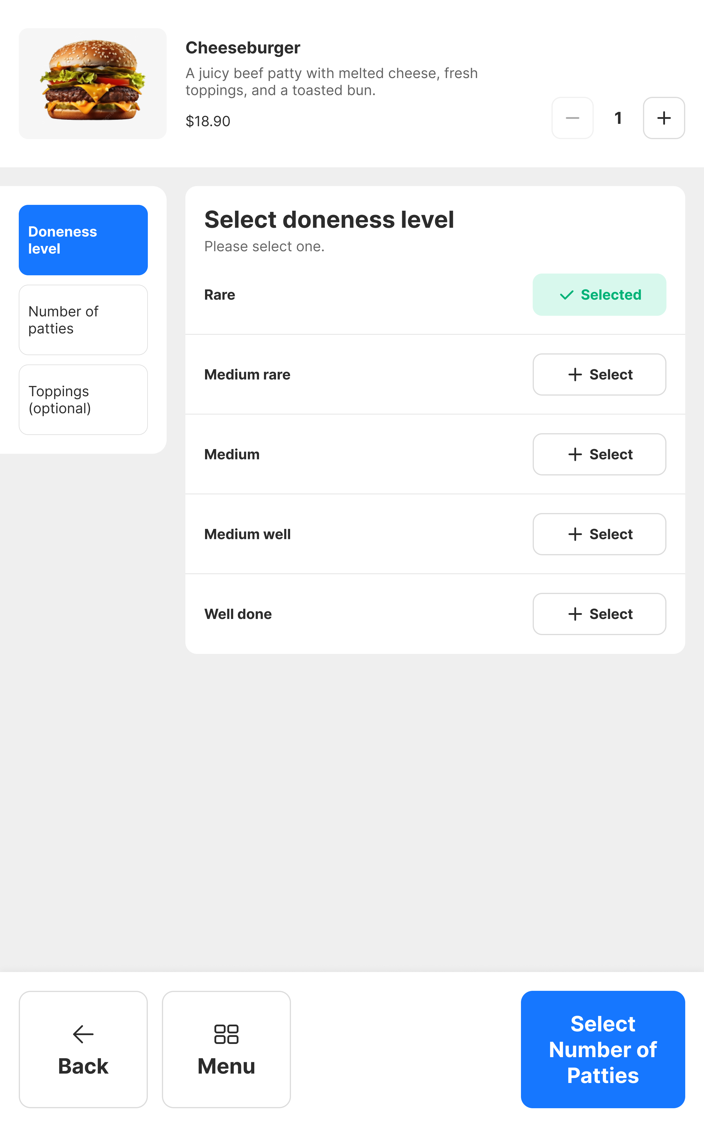
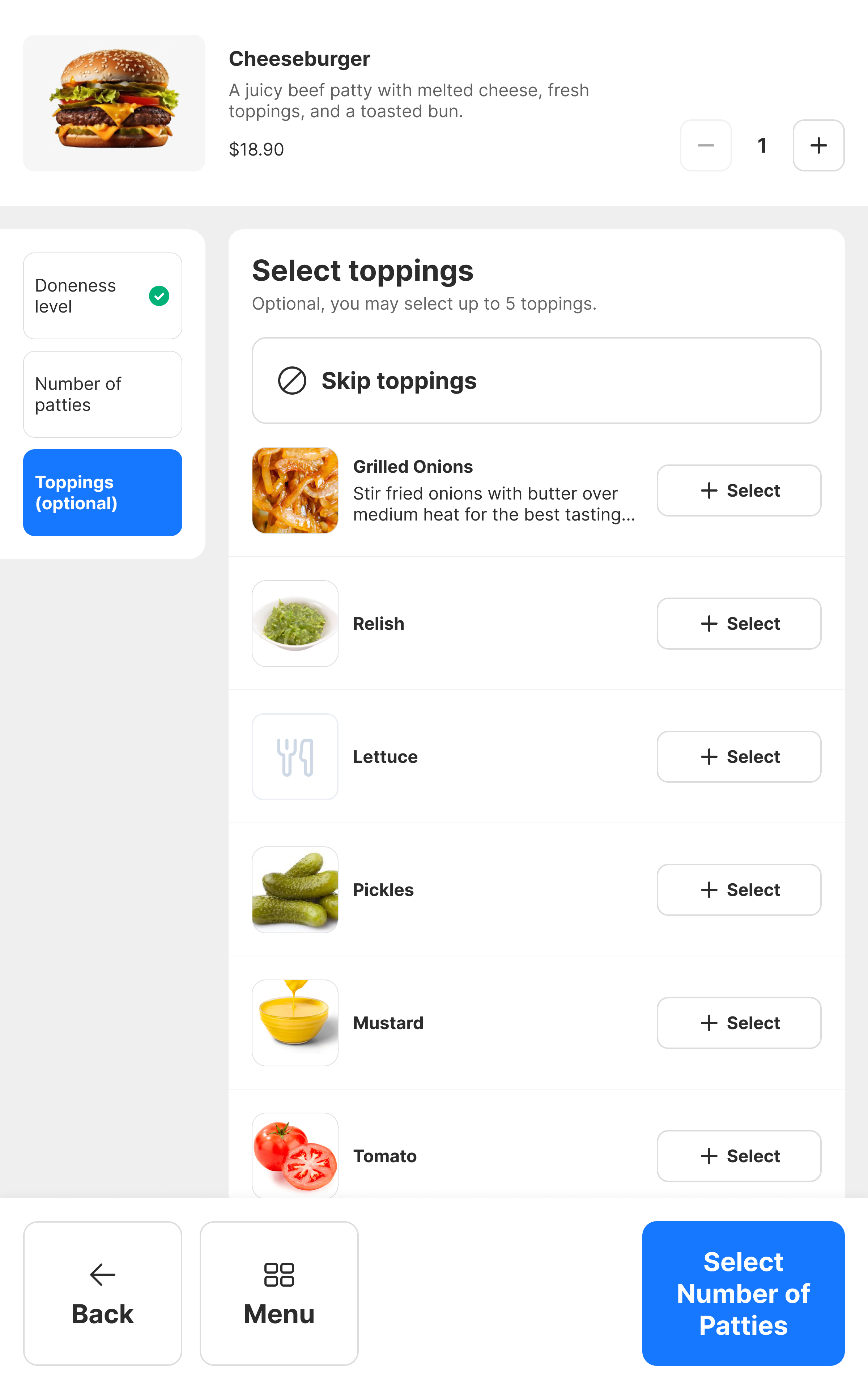
Faster for viewing and selecting modifiers but may overwhelm users with too many options.

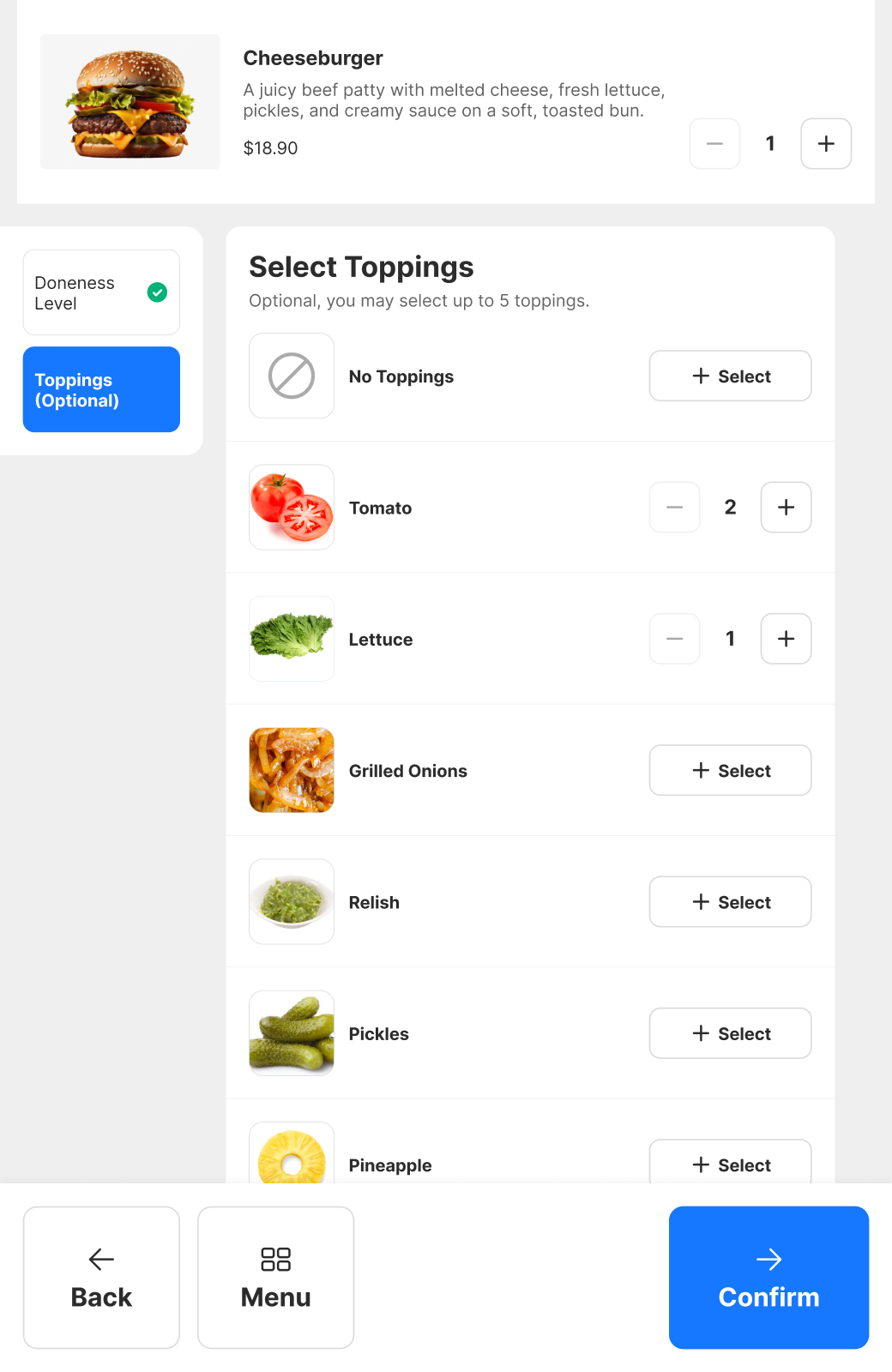
Focuses on selecting one modifier group at a time for easier cognitive load
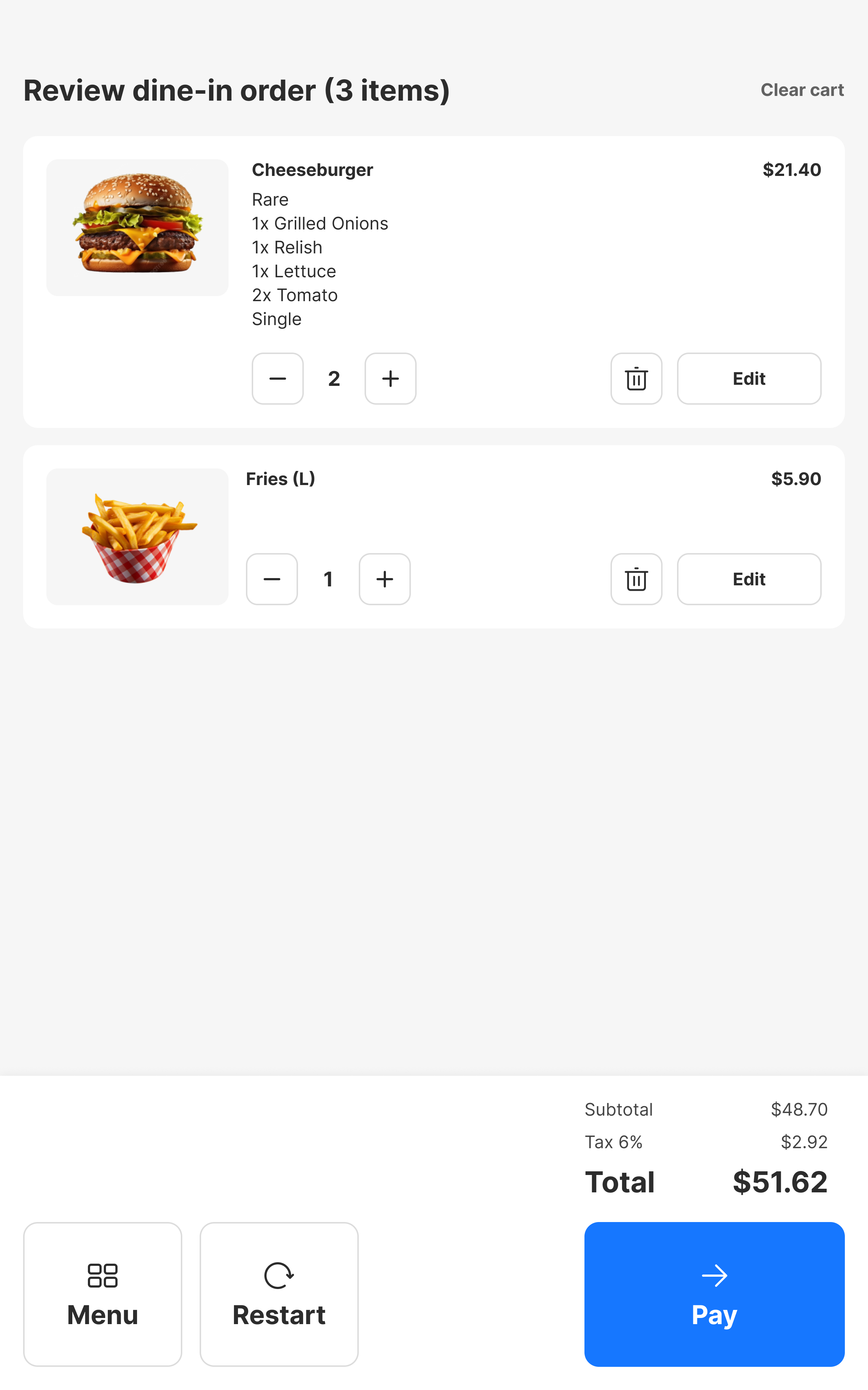
A review page allows edits before checkout.

Item details screens of kiosk
2
Guided Ordering Flow
Decision:
Implement a step-by-step modifier selection instead of an all-in-one page.
Rationale:
Given the complexity of some menu items—such as those with multiple customization options (e.g., toppings, portion sizes)—a guided flow was essential. This step-by-step approach breaks down decisions into manageable parts, reducing information overload and making it easier for users to process options.
Pros:
- Reduces cognitive overload by presenting choices sequentially.
- Ensures a structured, error-free selection process, especially for complex orders.
- Supports a wide range of modifier scenarios, from simple add-ons to multi-level customizations.
Cons:
- Slightly increases the length of the ordering process.
- Introduces potential drop-off points if users become fatigued.
Despite these concerns, we prioritized a guided flow to align with our core design principles—clarity, accessibility, and ease of use. This decision ultimately created a smoother, more intuitive experience for both new and returning customers.
🎉 Final Design & UI Enhancements
Our final design prioritized accessibility, clarity, and ease of use, ensuring a seamless self-service ordering experience. Each UI enhancement was carefully crafted to reduce friction while maintaining a polished, user-friendly interface.

Back

Menu

Restart
Secondary button

Add to cart$18.90
Confirm
Pay
Primary button

1


Edit
Action buttons
Select
Button components in kiosk design system
1
Large, Accessible Buttons
We designed interactive elements to be easily tappable and visually intuitive, catering to a wide range of users, including those with limited dexterity.

Strategic icon placement enhances clarity by pairing visual cues with text labels for faster recognition.
Square-shaped buttons provide a larger touch target, improving accuracy and reducing user frustration.
Outlined buttons increase affordance, making it easier for users to identify tappable areas while maintaining a clean, modern aesthetic.
This focus on accessibility ensures that users can confidently navigate the interface across different device sizes and physical environments.
constraining main content

Menu
Classic Burger
Angus Burger
Chicken Burger
Everyday Burger
Salads & Others
Desserts
Sides
Ice Cream
Drinks
Discover our menu
Classic Burger
Double Burger Happiness Combo
$25.90
Shroom Shroom Burger
$25.90
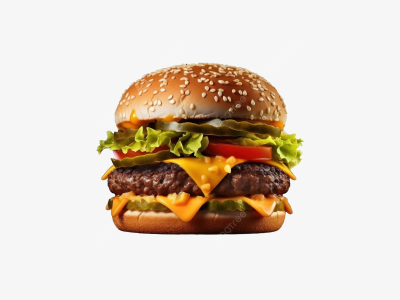
Cheeseburger
$25.90
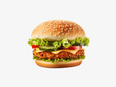
Fish Burger
$25.90
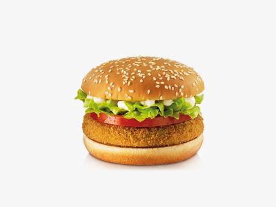
Fillet Fish Burger
$25.90
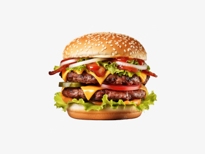
Double cheeseburger
$25.90
angus Burger
Double Burger Happiness Combo
$25.90
Cheeseburger
$25.90
Shroom Shroom Burger
$25.90
Double Burger Happiness Combo
$25.90
Cheeseburger
$25.90
Shroom Shroom Burger
$25.90
Double Burger Happiness Combo
$25.90
Cheeseburger
$25.90
Shroom Shroom Burger
$25.90


0
Total
$0.00

Restart

Checkout


Doneness Level

Toppings (Optional)
Select Toppings
Optional, you may select up to 5 toppings.

No toppings
Select
Tomato
2
Lettuce
1
Grilled Onions
Select
Relish
Select
Pickles
Select
Pineapple
Select
Cheeseburger
A juicy beef patty with melted cheese, fresh lettuce, pickles, and creamy sauce on a soft, toasted bun.
$18.90
1

Back

Menu

Confirm

Menu
Classic Burger
Angus Burger
Chicken Burger
Everyday Burger
Salads & Others
Desserts
Sides
Ice Cream
Drinks
Discover our menu
Classic Burger
Double Burger Happiness Combo
$25.90
Shroom Shroom Burger
$25.90
Cheeseburger
$25.90
Fish Burger
$25.90
Fillet Fish Burger
$25.90
Double cheeseburger
$25.90
angus Burger
Double Burger Happiness Combo
$25.90
Cheeseburger
$25.90
Shroom Shroom Burger
$25.90
Double Burger Happiness Combo
$25.90
Cheeseburger
$25.90
Shroom Shroom Burger
$25.90
Double Burger Happiness Combo
$25.90
Cheeseburger
$25.90
Shroom Shroom Burger
$25.90


0
Total
$0.00

Restart

Checkout


75%
25%
Menu and item details screens in kiosk
2
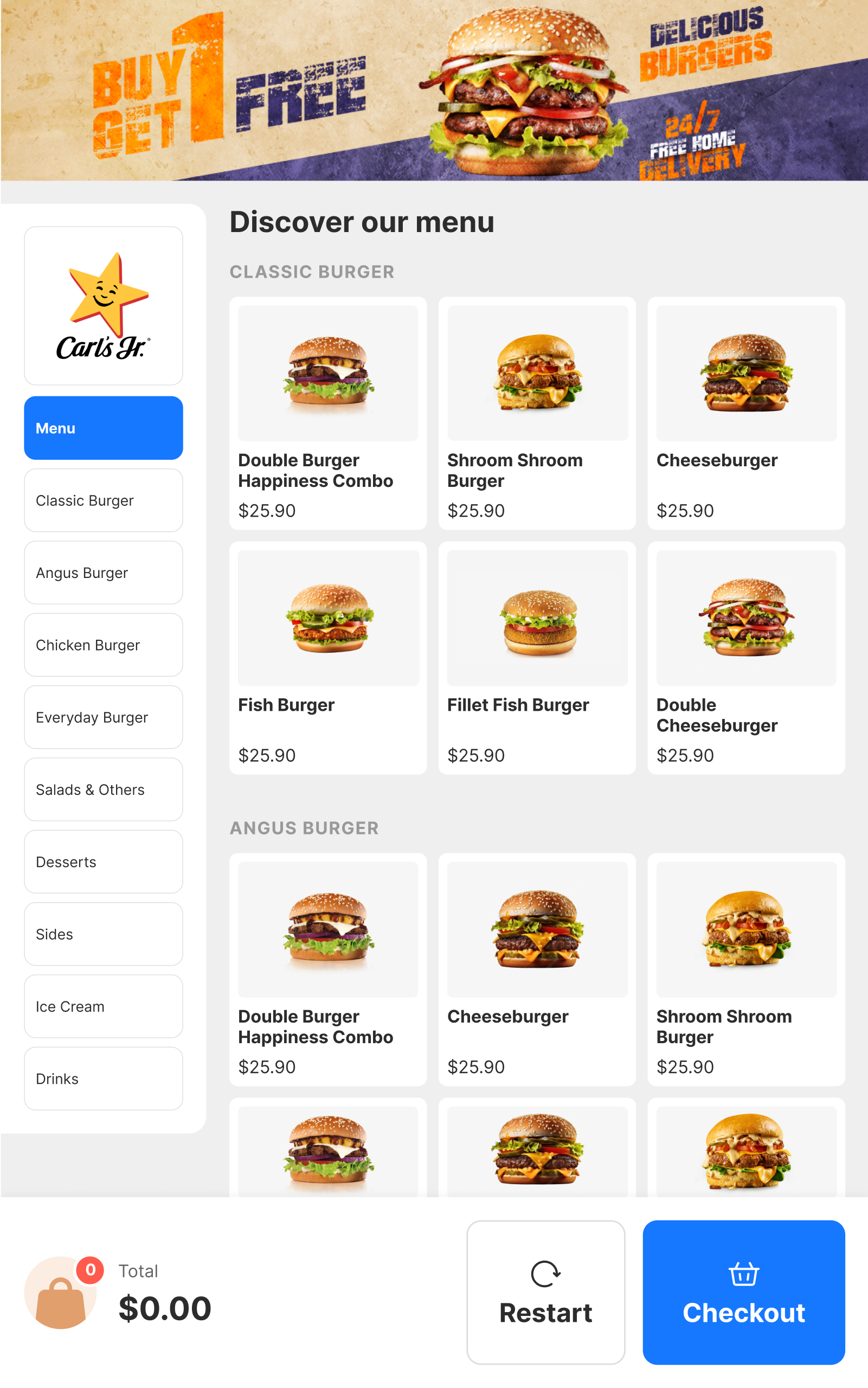
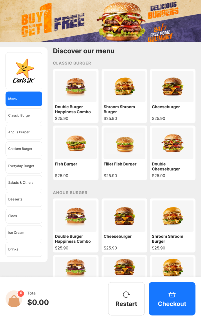
Optimized Layout
A thoughtful content distribution strategy enhances usability and supports scalable, future-proof design.
25% side panel, 75% main content area creates a clear visual hierarchy while offering flexibility for varied menu structures.
Key interactions are concentrated in the middle and lower screen areas, improving accessibility for users of all heights and reducing physical strain.
Reduced cognitive load through a structured layout helps users stay focused, especially during multi-step processes like order customization.
By optimizing the interface’s physical and visual flow, we increased user efficiency while accommodating different levels of familiarity with self-service technology.
Menu
Classic Burger
Angus Burger
Chicken Burger
Everyday Burger
Salads & Others
Desserts
Sides
Ice Cream
Drinks
Discover our menu
Classic Burger
Double Burger Happiness Combo
$25.90
Shroom Shroom Burger
$25.90
Cheeseburger
$25.90
Fish Burger
$25.90
Fillet Fish Burger
$25.90
Double cheeseburger
$25.90
angus Burger
Double Burger Happiness Combo
$25.90
Cheeseburger
$25.90
Shroom Shroom Burger
$25.90
Double Burger Happiness Combo
$25.90
Cheeseburger
$25.90
Shroom Shroom Burger
$25.90
Double Burger Happiness Combo
$25.90
Cheeseburger
$25.90
Shroom Shroom Burger
$25.90


0
Total
$0.00

Restart

Checkout
Doneness Level

Toppings (Optional)
Select Toppings
Optional, you may select up to 5 toppings.

No toppings

Select
Tomato

2
Lettuce
1
Grilled Onions
Select
Relish
Select
Pickles
Select
Pineapple
Select
Cheeseburger
A juicy beef patty with melted cheese, fresh lettuce, pickles, and creamy sauce on a soft, toasted bun.
$18.90
1

Back

Menu

Confirm
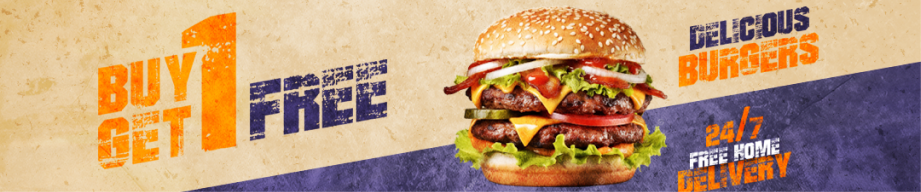
Top 15% of kiosk screens
3
Minimal Top-Screen Interactions
We minimized reliance on upper-screen touchpoints to align with natural hand positions and improve ease of use.
Primary actions are placed lower for better reachability, particularly on larger kiosks or screens.
Informational banners are positioned at the top, ensuring promotions and secondary details do not interfere with the main task flow.
This design choice improves comfort and accessibility while maintaining space for merchant-driven content without compromising user attention.
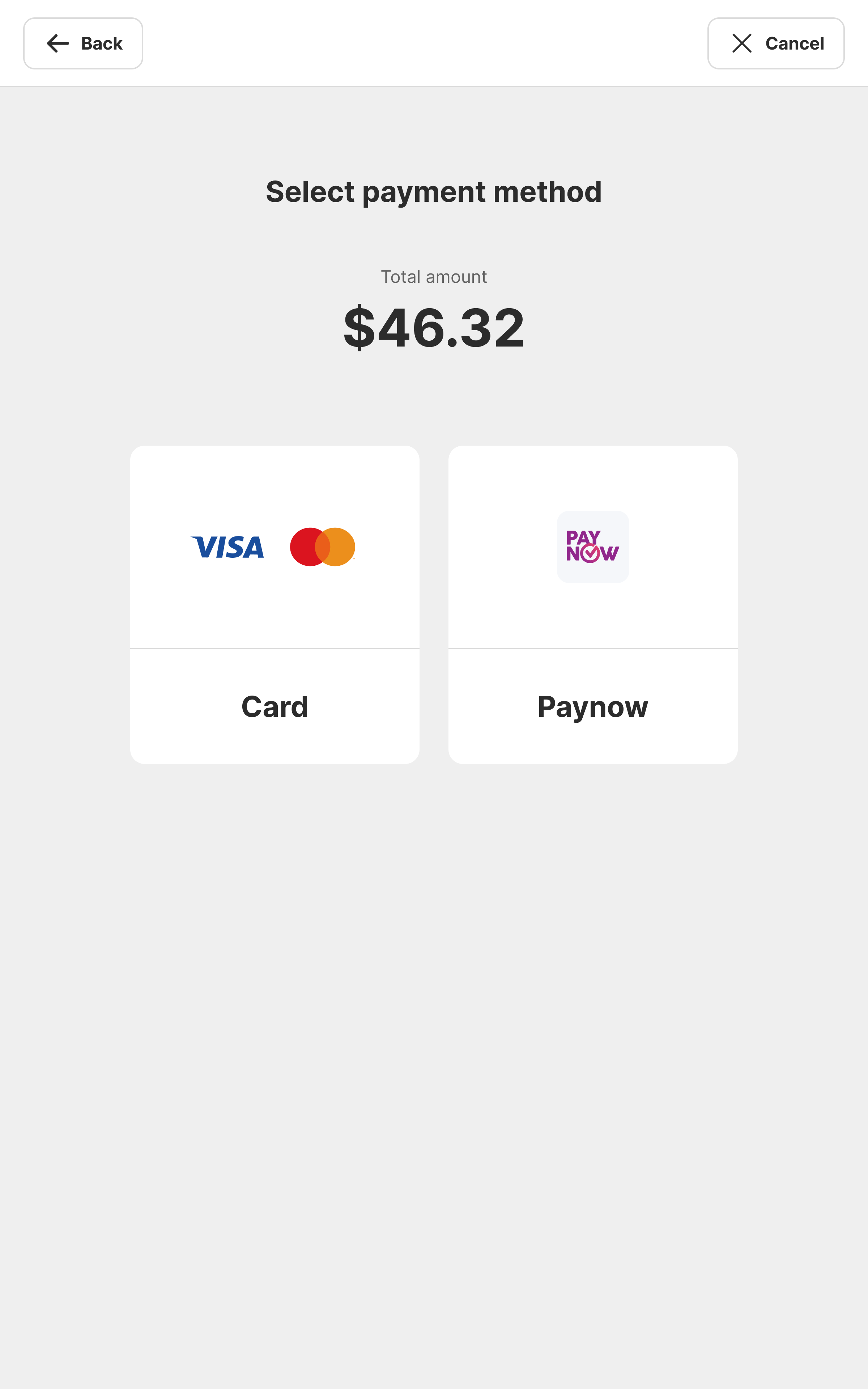
Card payment
enter pin

L3 - L5 transition
Animations & transitions on kiosk
3
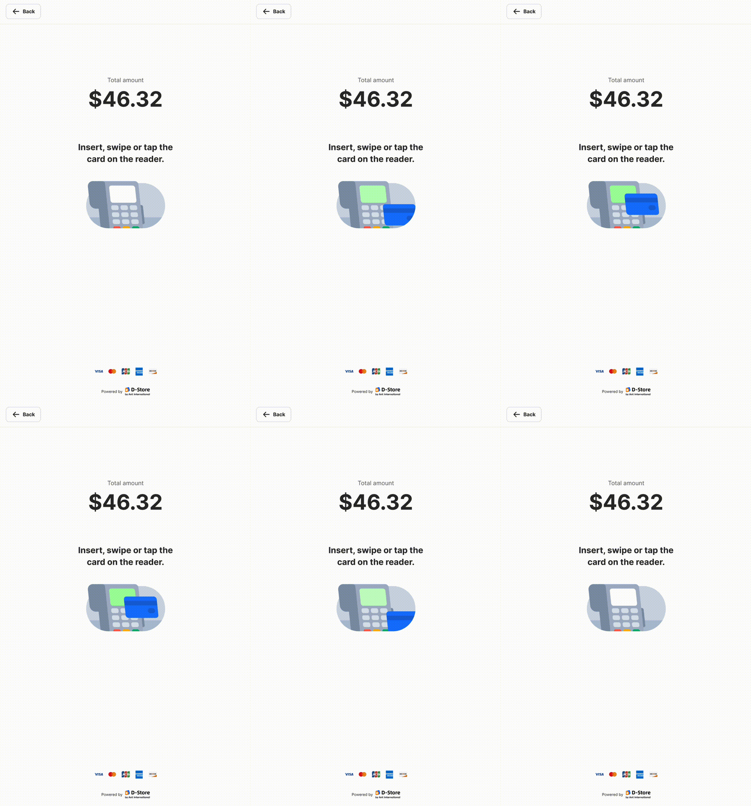
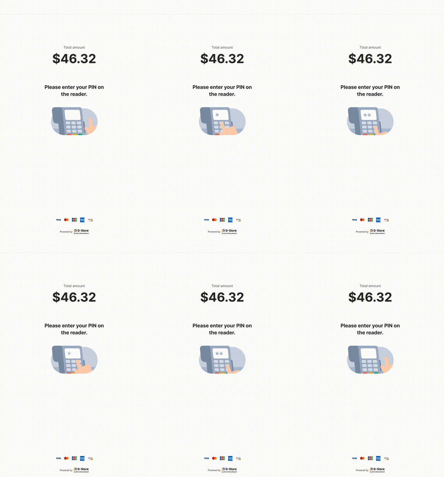
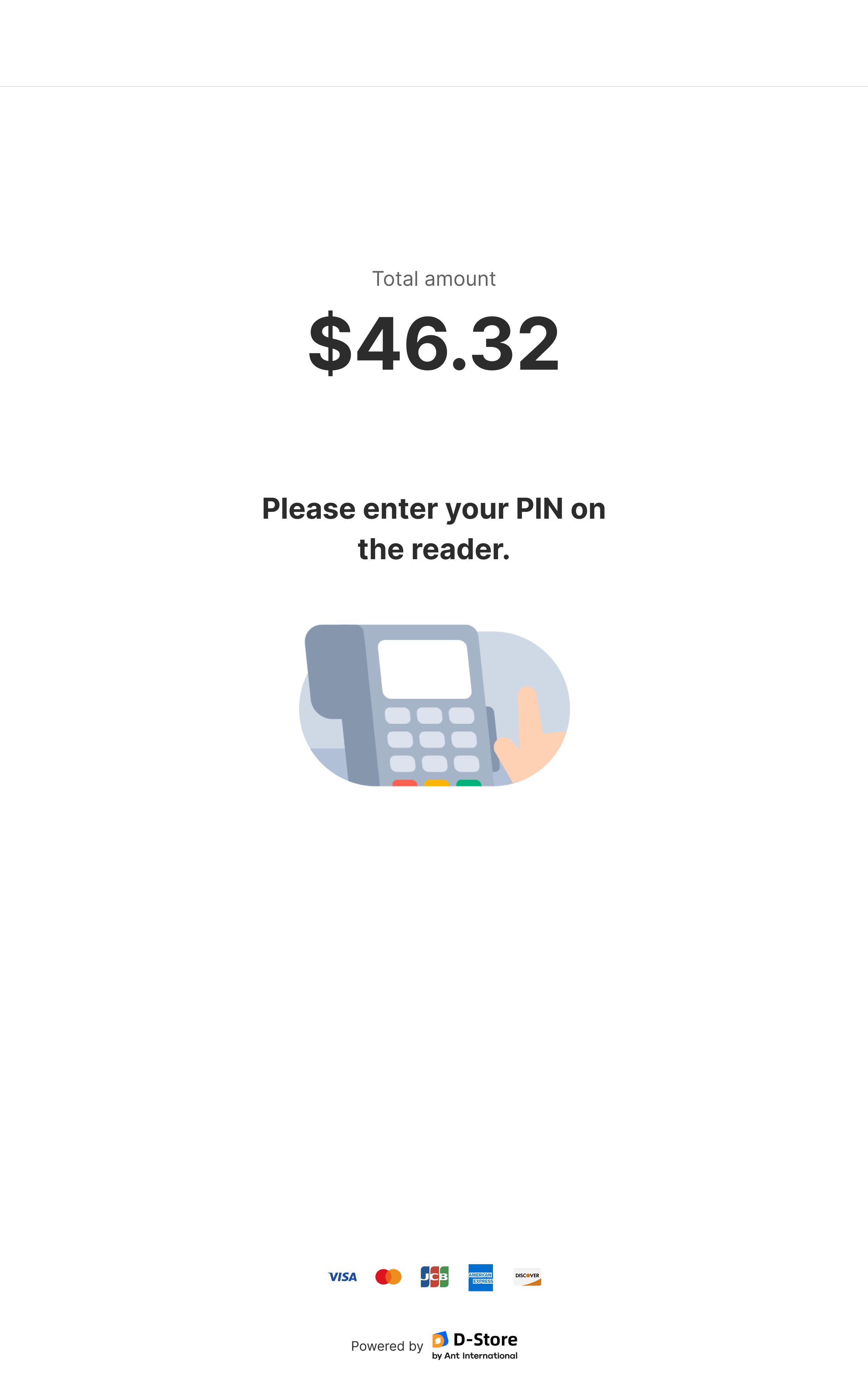
Subtle Animations for Engagement
Thoughtfully integrated animations provide feedback and guide users through the ordering journey without overwhelming the experience.
Micro-interactions create a more engaging interface by offering visual confirmation for key actions (e.g., item selection, order completion).
Error animations gently guide users toward corrective actions, softening the experience when issues arise (e.g., incomplete selections or payment failures).
These animations enhance the overall experience by making the interface feel responsive and approachable while supporting users in moments of friction.
Button components in kiosk design system
💥 Impact
Because of this project, we have managed to locked down a 3-year partnership with NTUC that is worth
SGD 1 million
Takeaways & next steps
While the MVP is complete, there are future enhancements that are prioritized and will be worked on:

User login for account-based vouchers.
Expanded voucher redemption functionality.
Merchant testing to measure drop-off rates, task completion times, and order success rates.
One of the biggest lessons from this project was the importance of observing real-world user behavior. Watching how people interact with the kiosk in everyday scenarios provided insights that we couldn’t have gathered from assumptions alone. Additionally, having a solid understanding of database structures was invaluable in bridging the gap between technical feasibility and design goals, ensuring that the experience remained seamless while supporting complex menu structures. Lastly, accessibility played a huge role in shaping the design. Since kiosks cater to a wide audience, including those who may not be tech-savvy, making interactions intuitive and physically accessible was key to creating an inclusive self-service experience.
- End, thank you for reading! -