
Delighting Experiences Through Motion
MoneyLion is a financial app designed to help users take control of their money and build financial confidence. From banking to investing, the experience combines powerful tools with educational content to make finance more approachable.
However, the app is text-heavy, especially when explaining features that are not as common/complex. While the written content is informative, it can sometimes feel overwhelming or hard to digest quickly.
This case study focuses on how I explored animation as a supporting storytelling tool within MoneyLion — to make information easier to understand and more delightful to engage with.
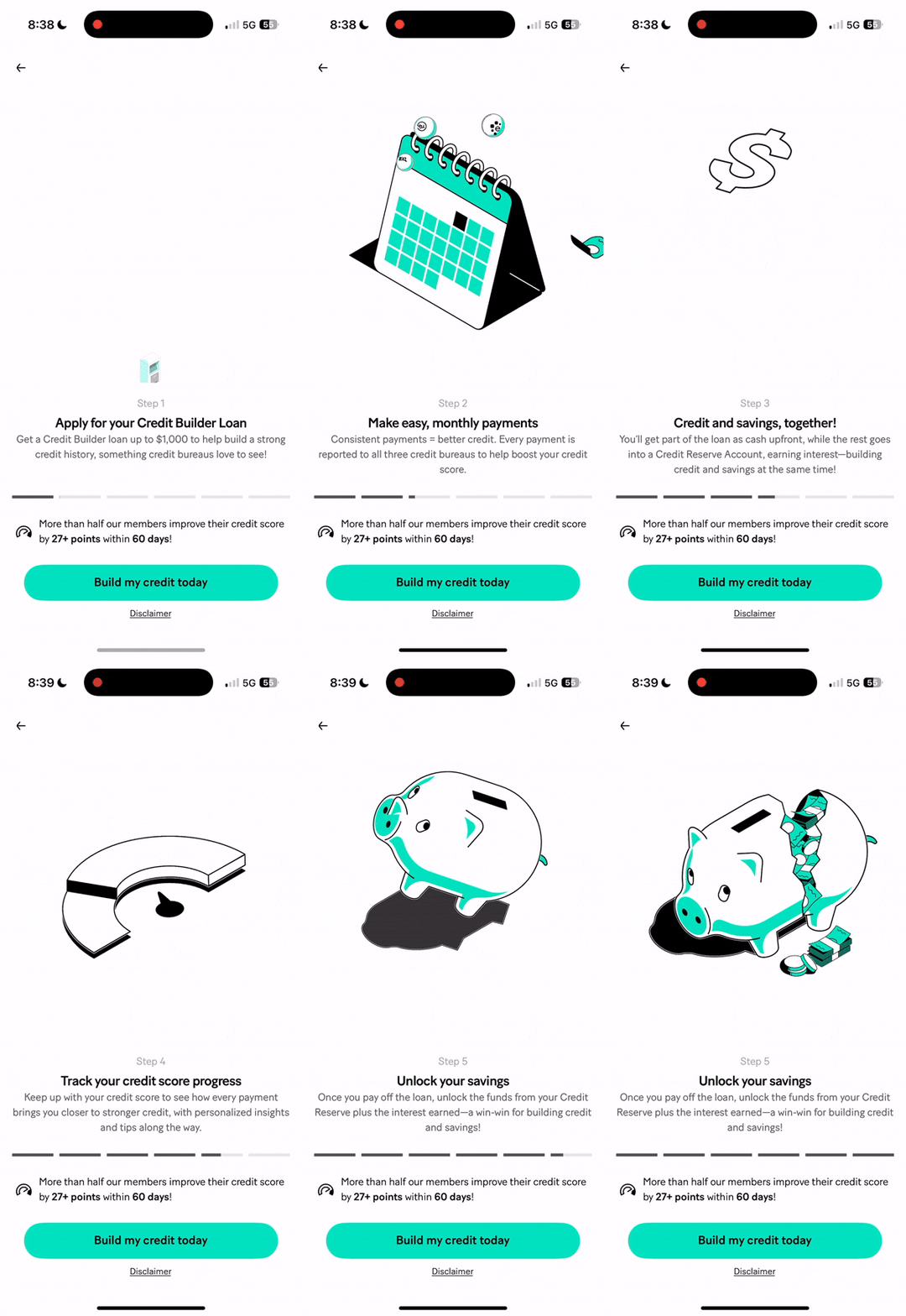
Credit Builder+ introduction on MoneyLion
Problem
As the product evolved, more animations were added across the app — but not always consistently or purposefully.
This led to a few common issues:

1
Overuse of motion

1
Too many animated elements competed for attention, making it harder for users to focus on the main content or task.
2
Animations that were too flashy
1
Large or exaggerated movements often drew the eye to decorative elements instead of functional ones, disrupting the flow of interaction.
3
Slower reading and comprehension
1
Some animations took too long to complete, delaying transitions and making it feel like users had to “wait” before they could move forward.
4
Motion fatigue
1
Continuous movement on static screens (like dashboards or lists) caused visual strain and distraction over time, especially during frequent use.
Goal
The goal was to redefine MoneyLion’s animation approach:

Support complex content through clear visual storytelling
Ensure motion is user-friendly and accessible
Apply animation only where it adds meaning or delight
Animation Principles
Most animations on the app today focuses on large and bombastic animations. It was key to redefine how animations should enhance the message of the interface rather than overpower it.
1
Be subtle
1
Small, gentle movements often feel more refined than large, bouncy ones and helps to avoid distraction.
2
Limit loops
1
Avoid endless loops for static screens and keep animations to static after 2-3 cycles.
3
Feel delightful
1
Add small, thoughtful touches that make users smile and make their experience memorable regardless of happy or negative scenario.
When to use animations


When introducing new or complex features
When motion helps explain concepts faster than text
When aiming to delight without disrupting
Process

1
Analyze the content copies
1
I started by reading and understanding the content and goal of the interface and the exact message we want to convey. The goal was to find opportunities where motion could clarify a point, illustrate a relationship, or make potential unpleasant experiences better.
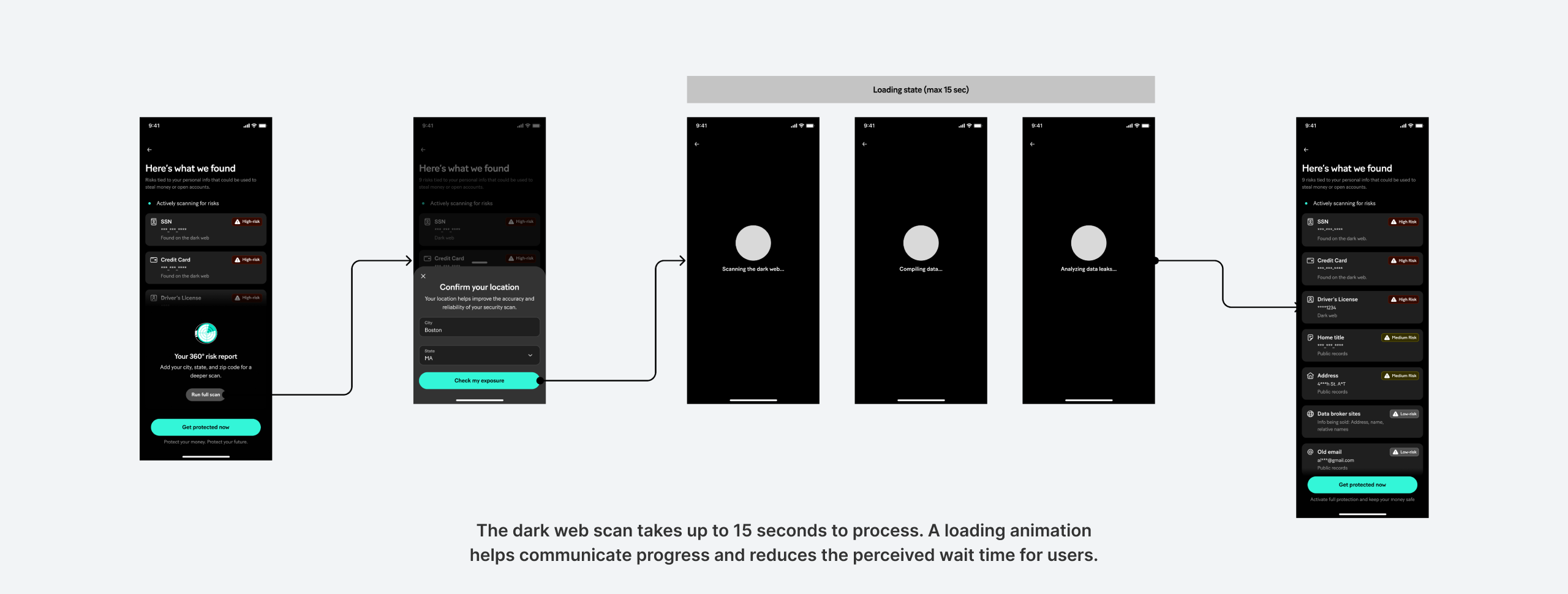
Gathering context for Dark Web Scanning
2
Draft, research and plan the animation
1
I will do some quick sketches to visualize timing and flow of the animation once I understand the intent of the animation. I usually set an overall tone on how I would imagine the animation should feel - whether it needed to feel dynamic, smooth, or calm. I would also research or find how other’s would do similar animations as an inspiration as well.
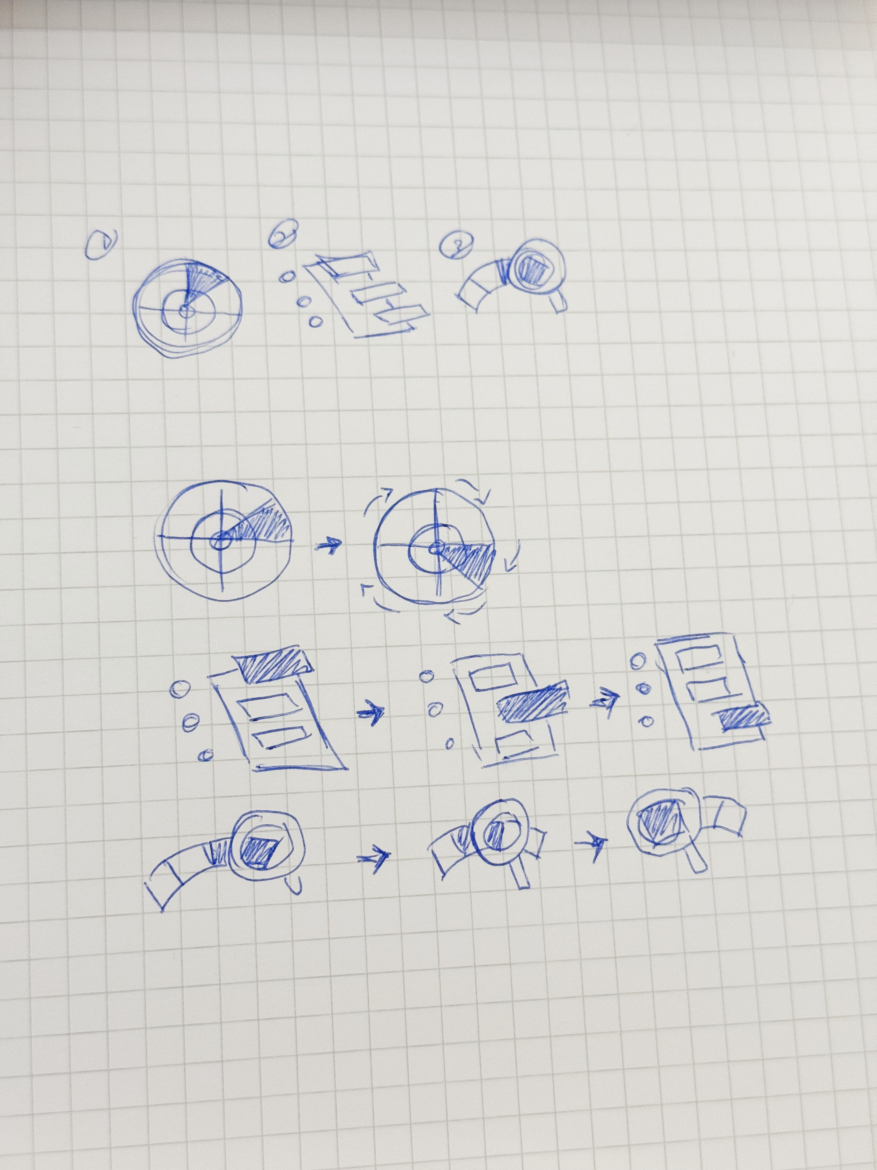
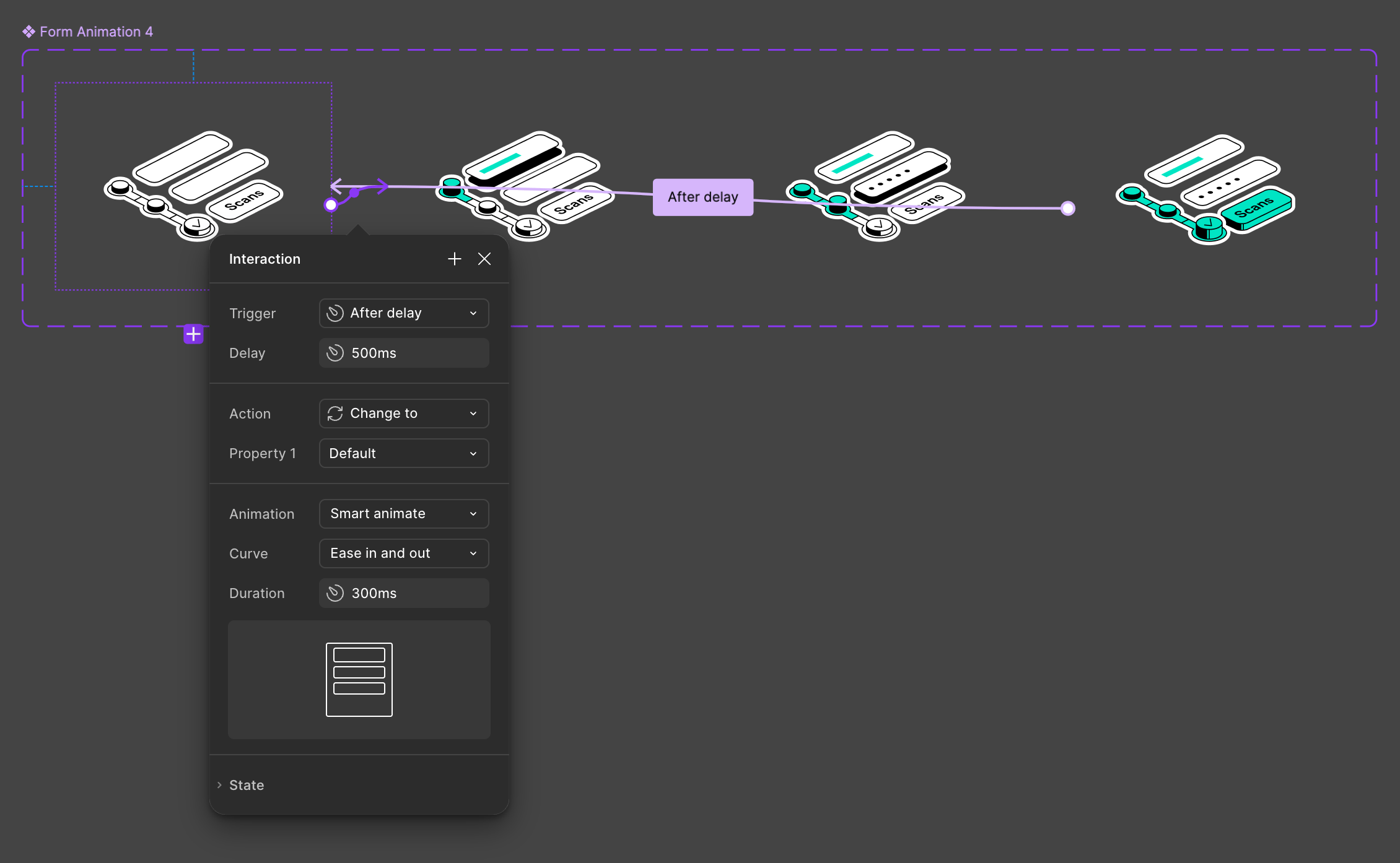
Dark web loader drafts
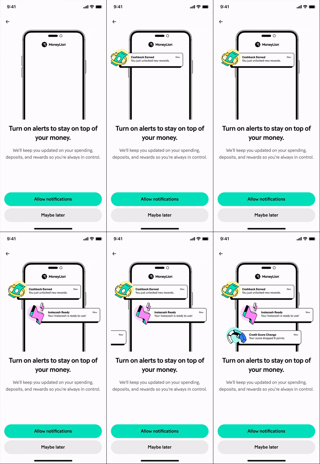
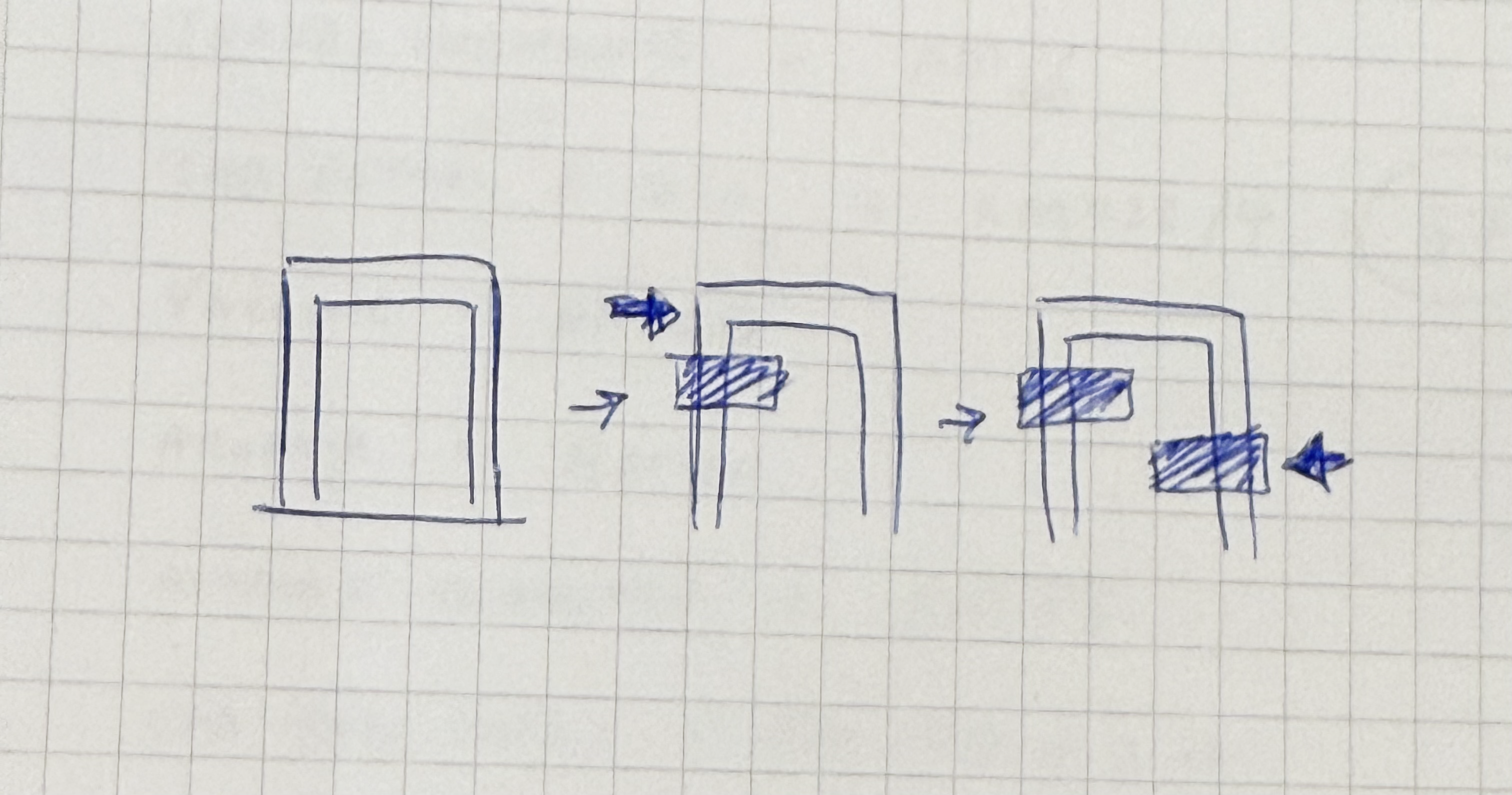
Notification drafts
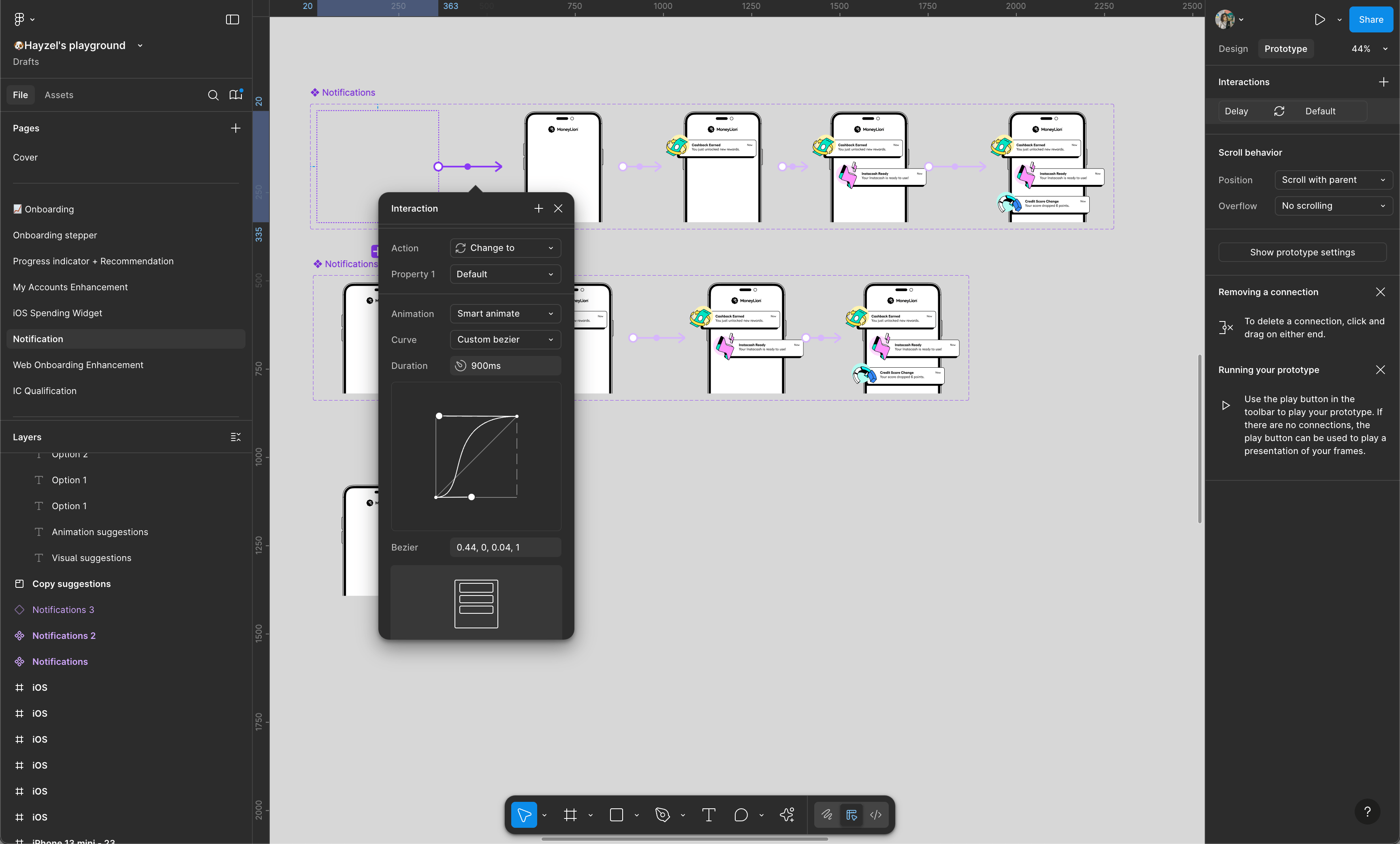
Planning the animation for Push Notifications
3
Iterate and refine the animation
1
I would adjust keyframes, easing, and pacing through multiple rounds of testing. Each tweak focused on improving readability and balancing motion energy with the content’s rhythm. This helps to refine the animations that felt too sluggish or too fast.
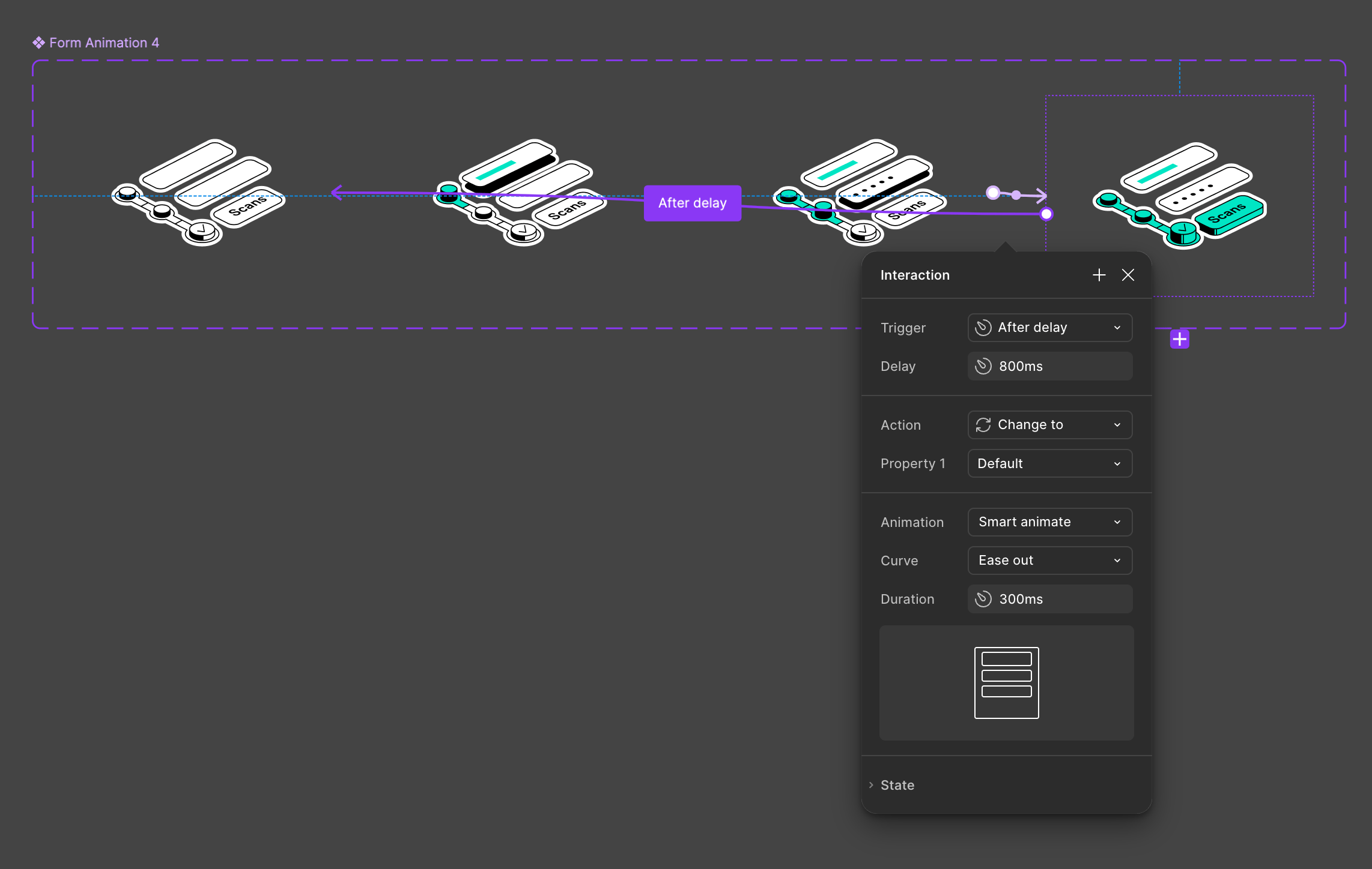
Although the looped animation repeats the same keyframes, varying the delay or easing at the start and end helps achieve a softer, more seamless loop.
Adjusting keyframes for dark web scan loader
3
Finalizing, testing and validating on prototype mode
1
Finally, I implemented the animations within actual interface to test how they felt in real use and compare with different animations. I’d also take this time to do some quick internal validations with colleagues/friends/family during this stage as well.
Option 2Subtle
Option 1
Dynamic
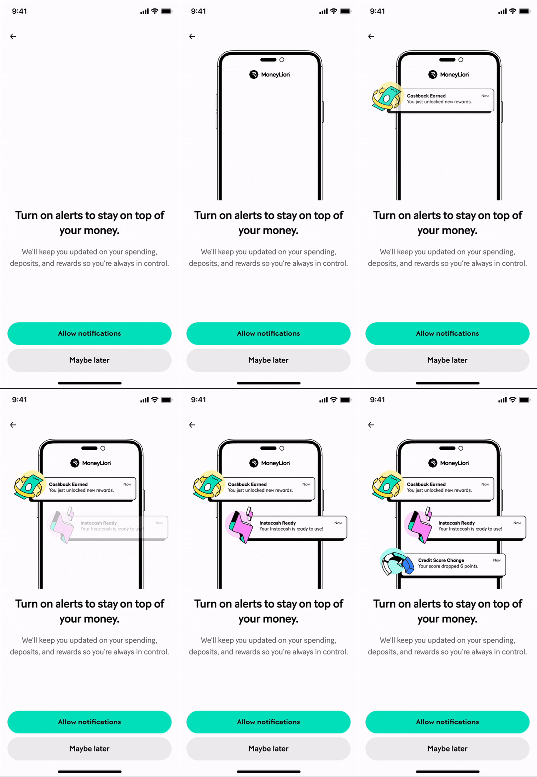
Options for Push Notifications
🎉 Final Animation Samples


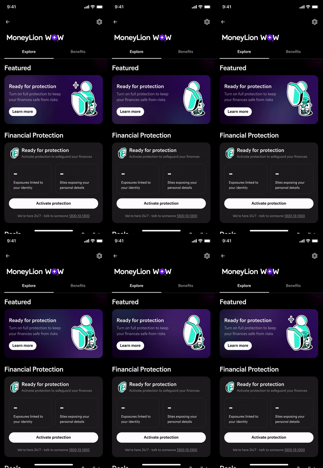
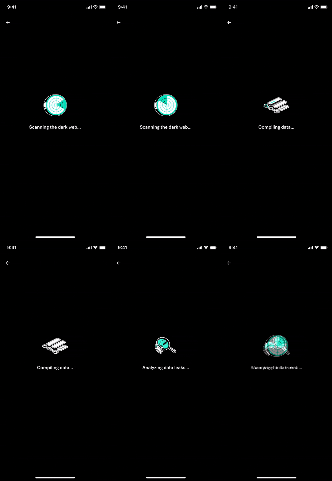
Enhanced animations on MoneyLion today
Key learnings & takeaways
I’ve learned that good animation is all about balance, between clarity and emotion, purpose and play. To me, the best motion feels invisible yet impactful as it guides users effortlessly and brings warmth to the experience. I’ve also learned to practice restraint, even when it’s tempting to make motion bigger or flashier. Subtle, intentional movements often do more to build trust and keep users engaged. Every animation I design now aims to feel purposeful, polished, and humanize.
- End, thank you for reading! -