
Creating a shared design language for AI experiences
AI features were shipping across MoneyLion from multiple teams at once with different designers and PMs, each solving their own use case, with no shared design language between them. Before this diverged further, I led the work to define a common AI component system: auditing where AI was already showing up, identifying the handful of contexts those use cases actually clustered into, and designing a shared architecture flexible enough to serve all of them.
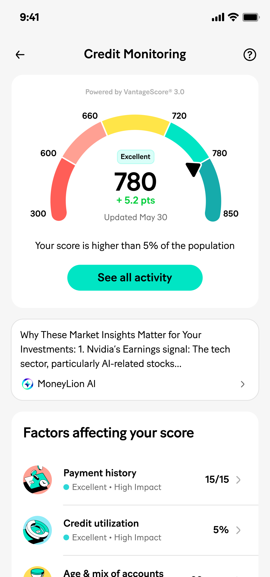
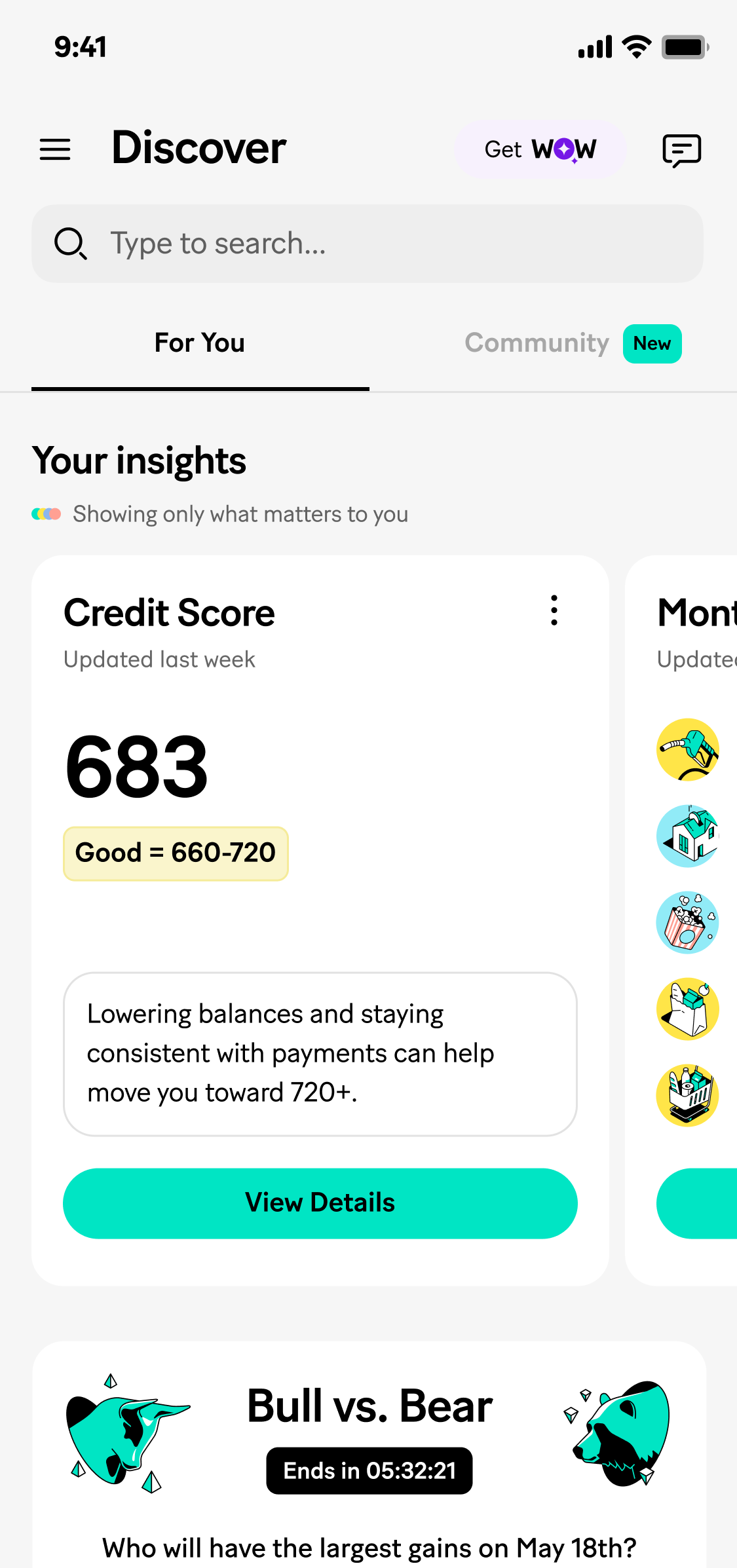
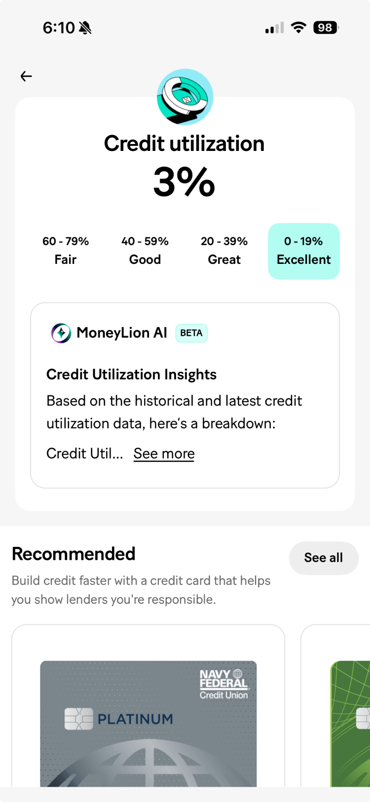
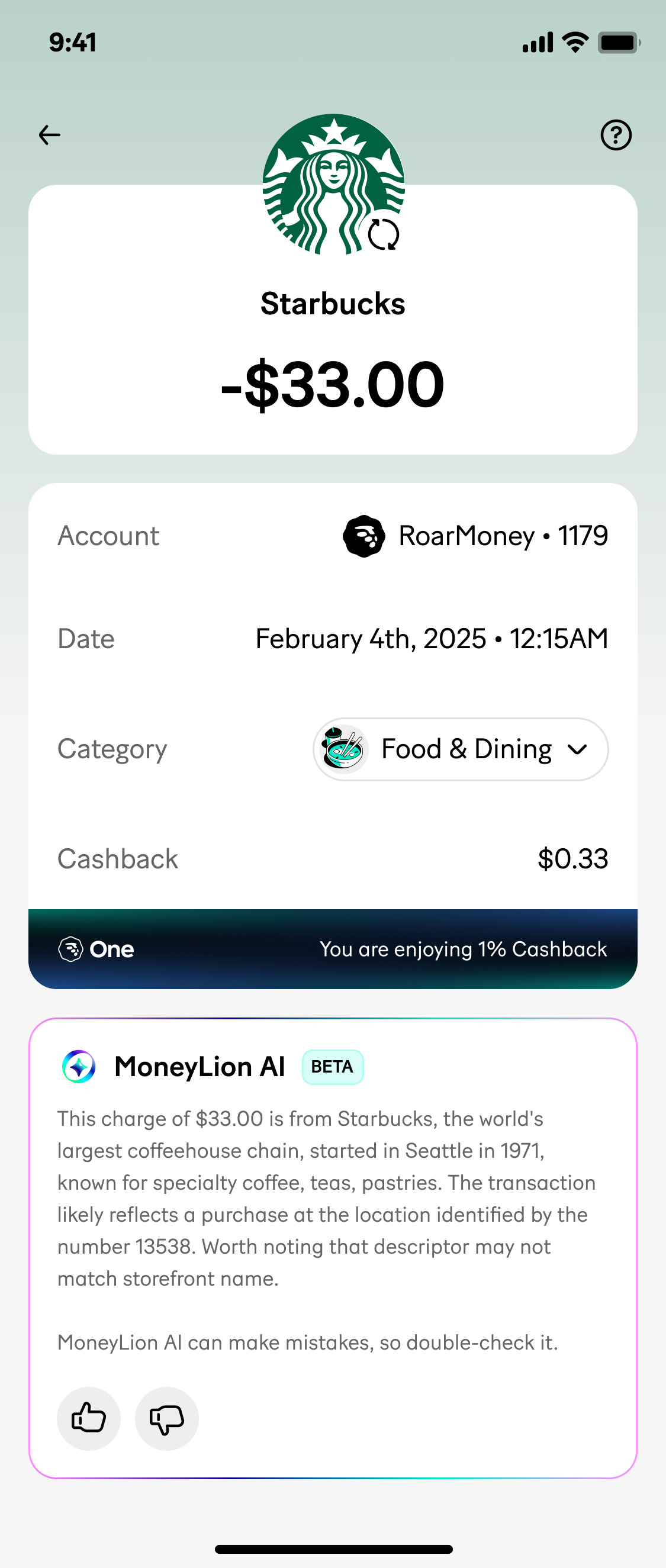
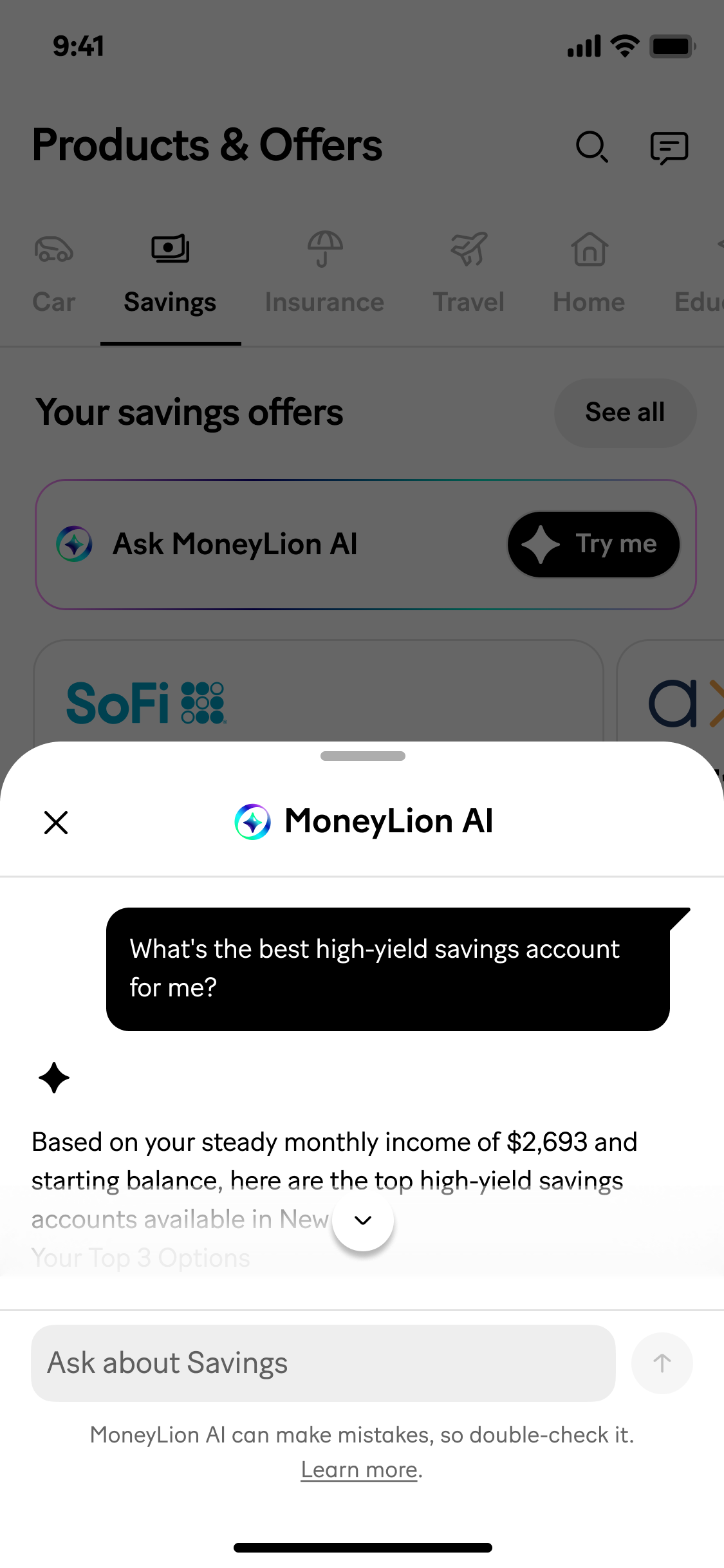
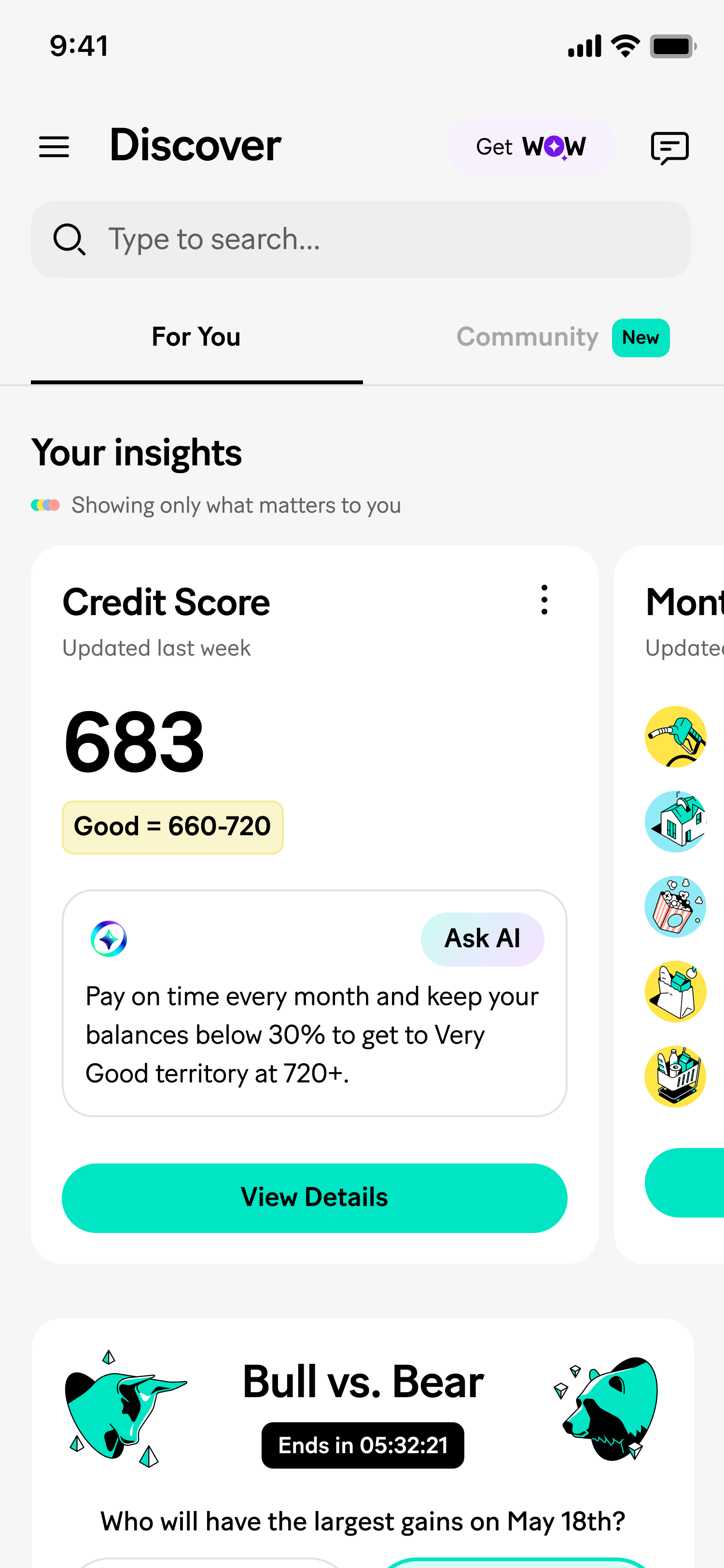
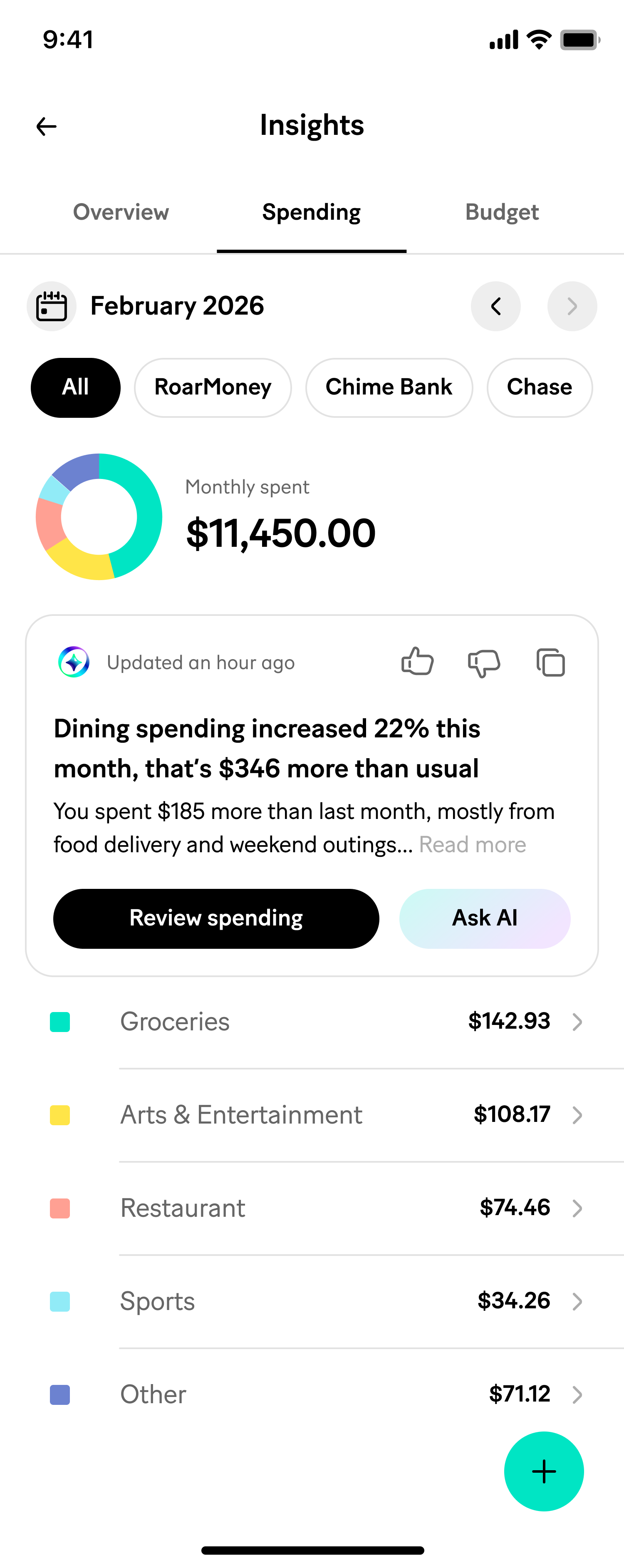
Various AI components on MoneyLion currently
Problem

1
No shared design language across teams

1
Multiple designers and product people across the company were independently building AI-powered components (insights, chat, recommendations) with no shared pattern between teams.
2
Fragmentation compounding over time
1
Left alone, this meant every team's AI surface would look, behave, and read differently, even when solving structurally similar problems.
3
No framework for choosing the right AI pattern
1
No existing framework for when an AI interaction should be a small in-context snippet versus a page-level experience versus a full conversation.
Problem statement
How might teams building AI features independently still end up speaking the same design language?
Key design decision

1
Started from an audit, not a spec
1
Rather than prescribing a component system top-down, I looked across what was already being built or proposed and identified where the real differences were.
The use cases clustered into three distinct contexts by scale and intent:
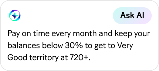
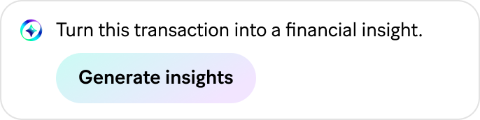
- Snippet context that lives inside another card's UI, like a discover card
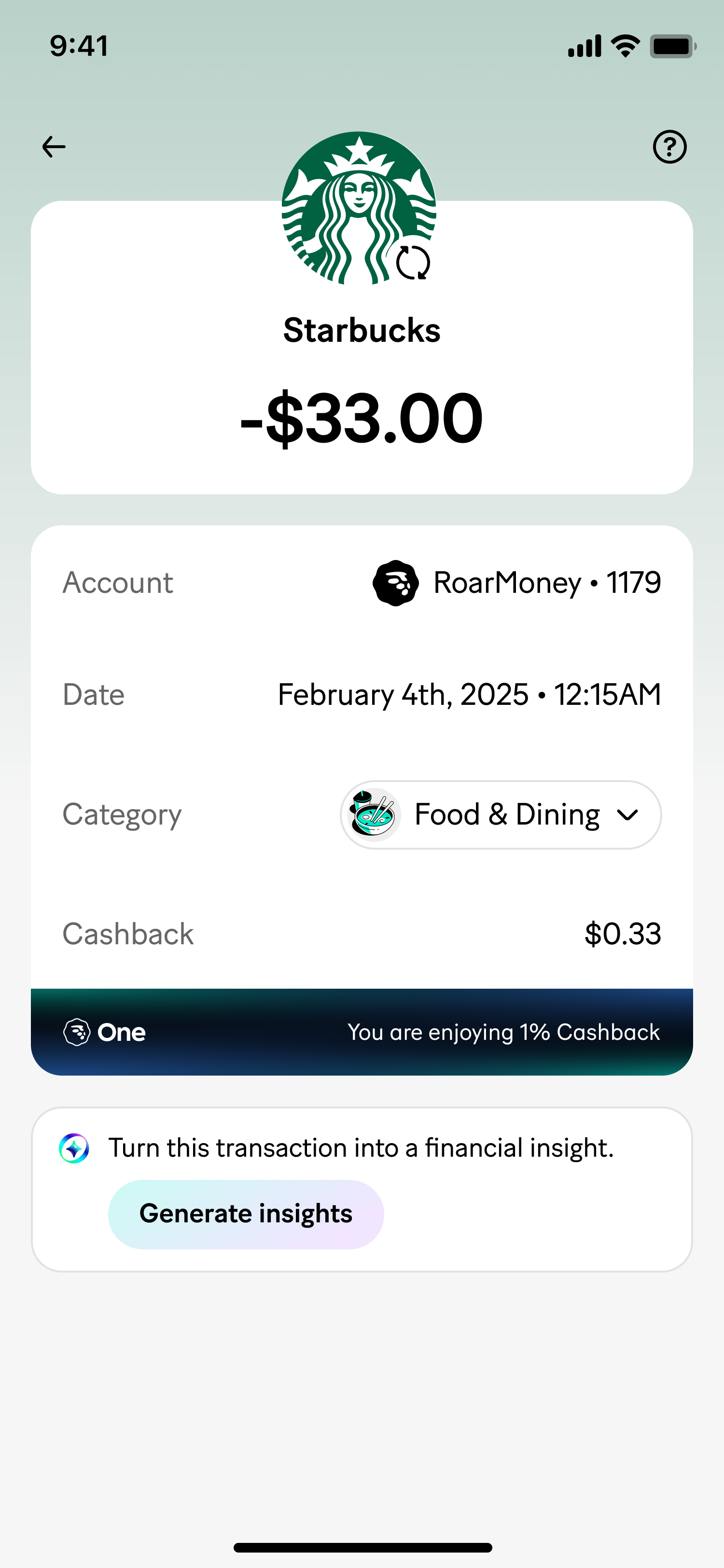
- Single-item context, an embed tied to one thing, like a transaction
- Page context, an embed that belongs to an entire page, like insights or wealth
That clustering became the system's actual foundation, not an assumption imposed on it.
2
Defined three variants around context, not visual size alone
1
Each variant's job is scoped to the amount of context it's attached to:
- Small Embed, a card-in-card, discover-style surfaces
- User-Initiate Embed, single-item context, like a transaction
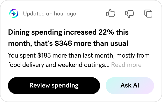
- Expanded Embed, whole-page context, like insights or wealth
This gave any team building a new AI feature a clear answer for which pattern fits their surface, instead of inventing a new one.
Located in a card of a specific metric
SNIPPET
Belongs to an entire page
PAGE CONTEXT
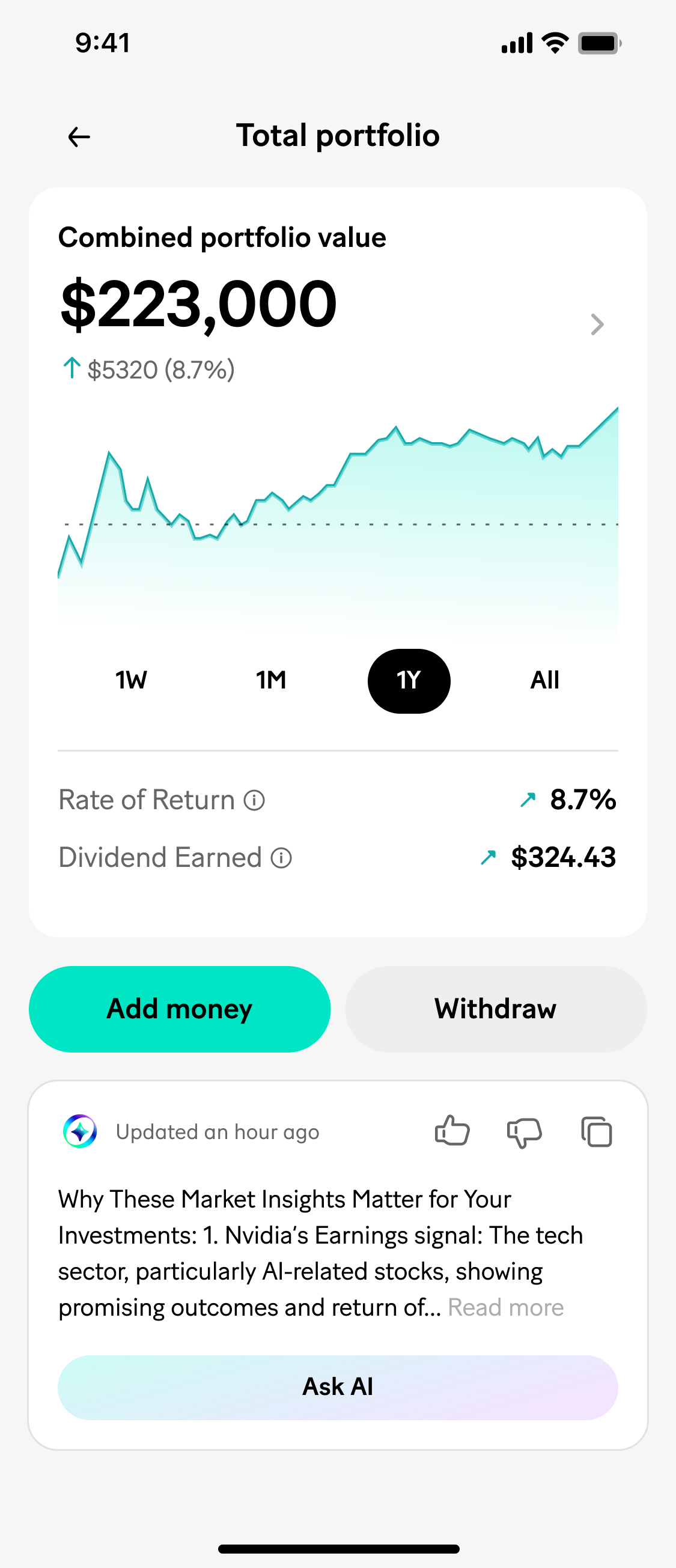
Belongs to a low-traffic page for lower costs
USER INITIATED
Map of existing AI features categorized to three contexts
3
Chose drawer-mode chat as a deliberate experiment
1
Because this was new territory for the org, we were also testing how AI should advise users at all — not just where.
The default pattern would have been navigating to a dedicated chat screen — the most room for a real conversation, but it pulls the user away from the page they were trying to understand.
What we chose instead was drawer-mode: chat opens as an overlay on top of the original page rather than a full navigation.
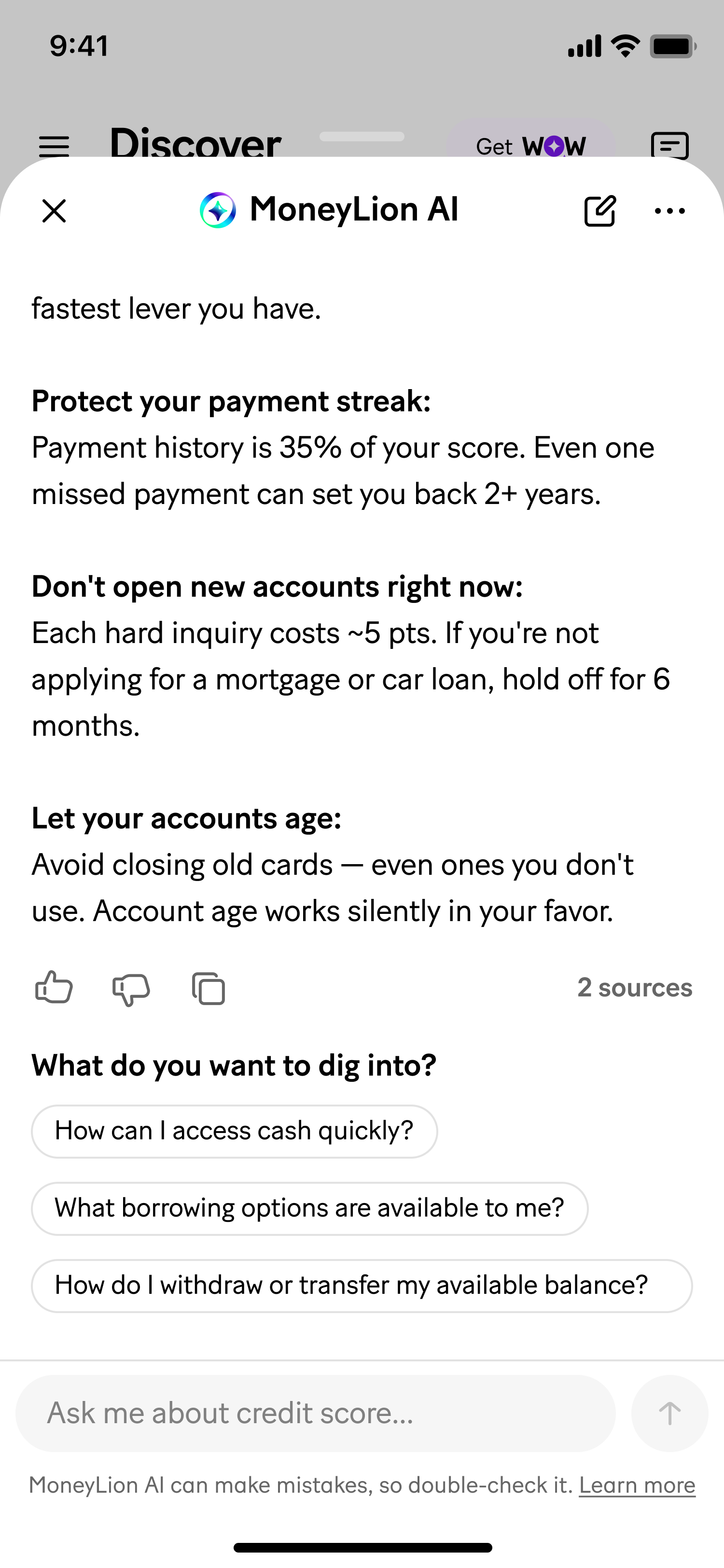
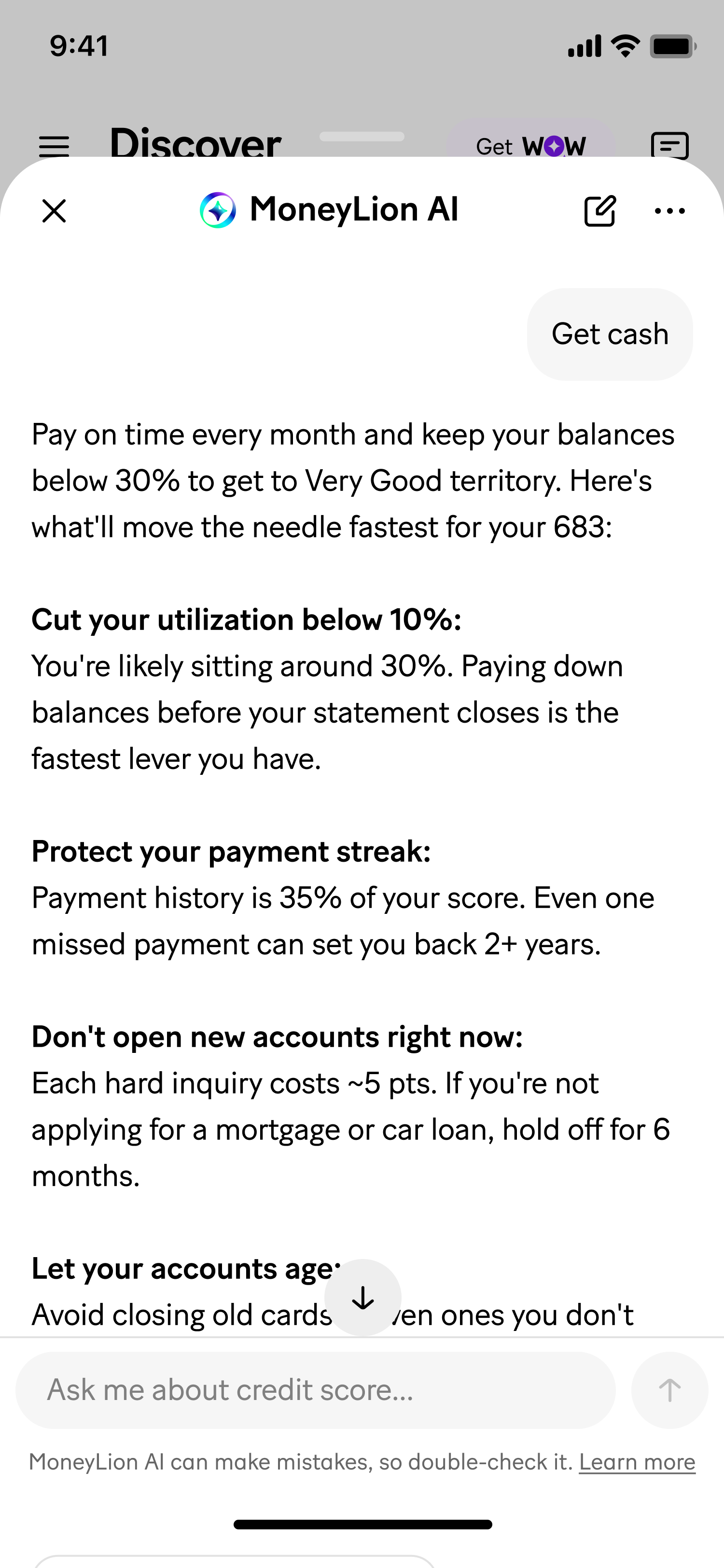
The trade-off is real — a drawer is more constrained than a dedicated screen — but it means a user reviewing their dining spend can ask the AI to go deeper without losing their place or their original train of thought. Since this pattern was unproven internally, treating it as a deliberate experiment, not the obvious final answer, was itself part of the decision.
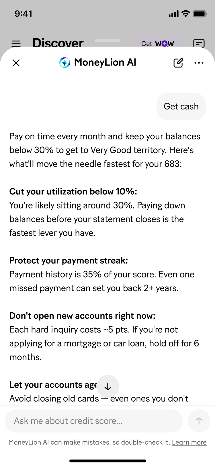
User can come from a contextual entry point without losing original train of thought
DRAWER CHAT
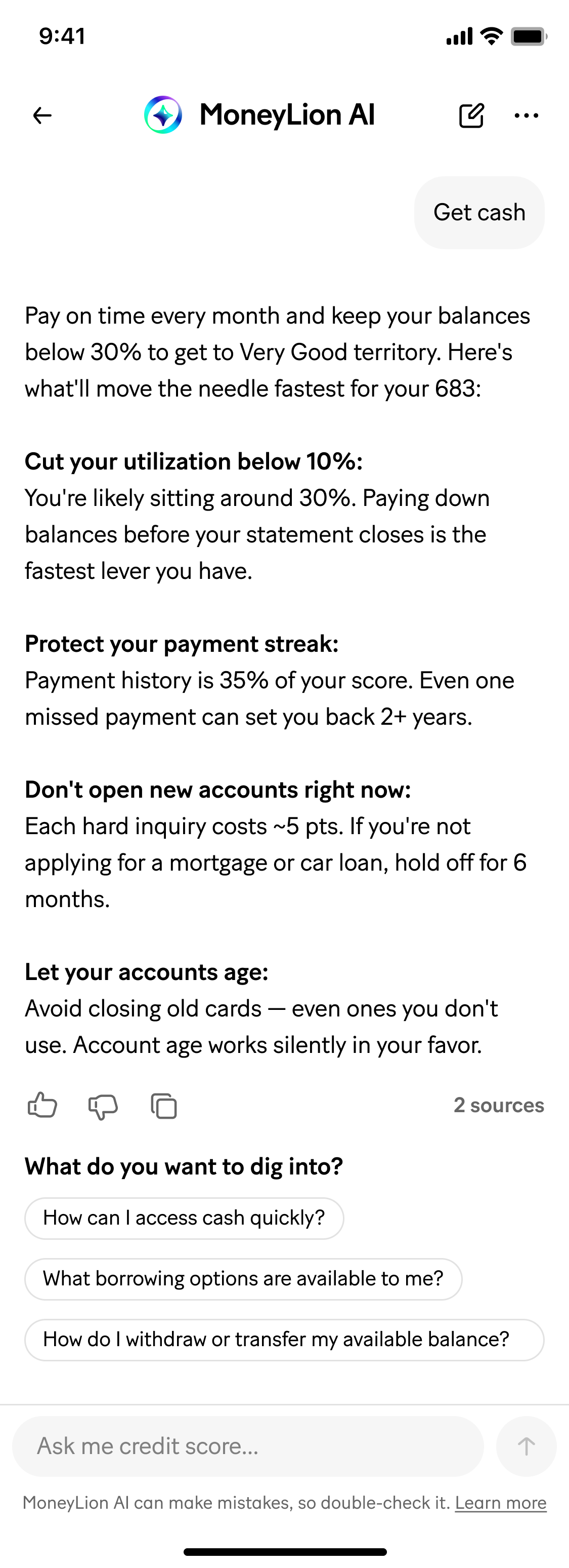
User will have full width and immersive experience but may lose their place from an embed
FULL CHAT
Drawer-mode chat vs. full-screen alternative
4
Built one shared escalation point across all three variants
1
However a user enters, going deeper always resolves into the same drawer-mode chat experience
The system stays coherent even though the entry points look and behave differently by design.
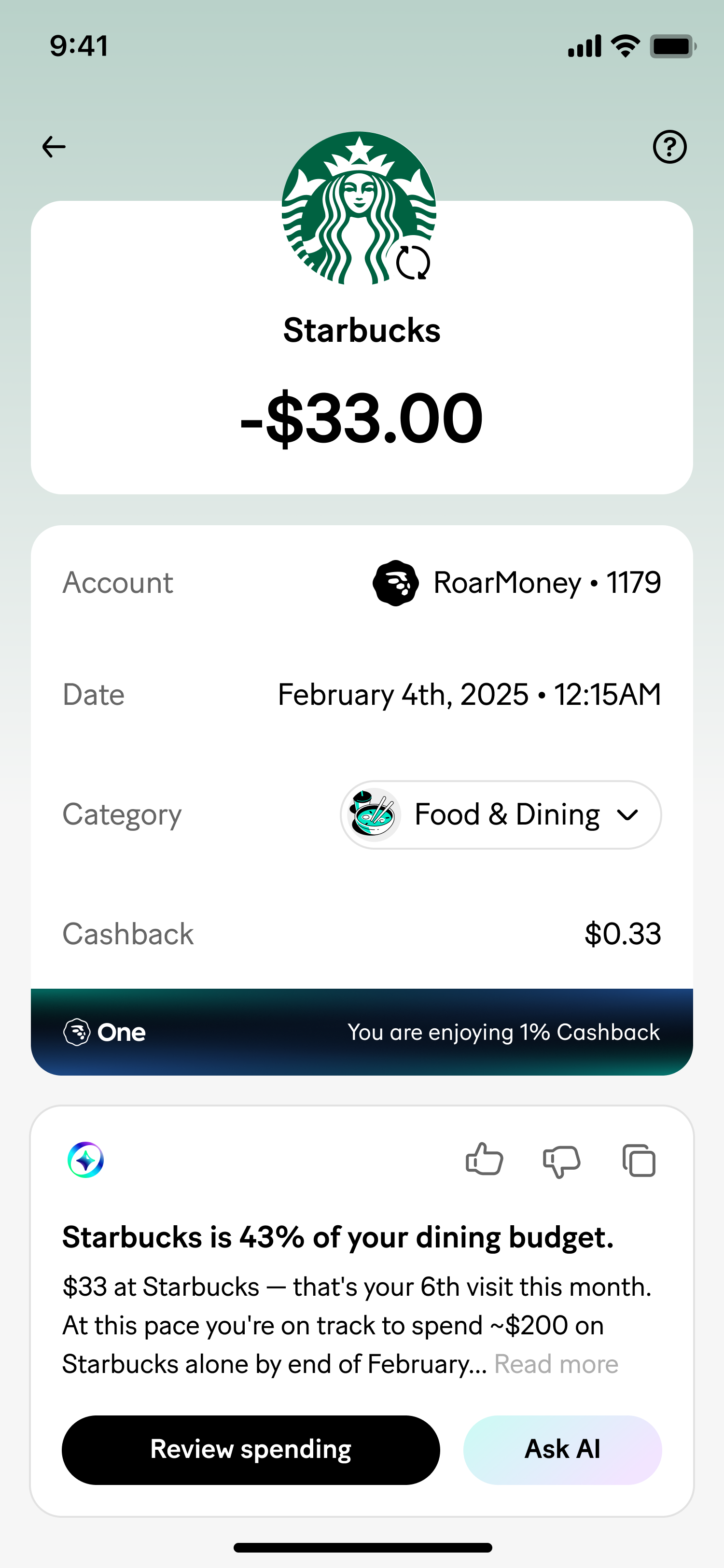
DISCOVER
SPENDING
TRANSACTION
INVESTMENT
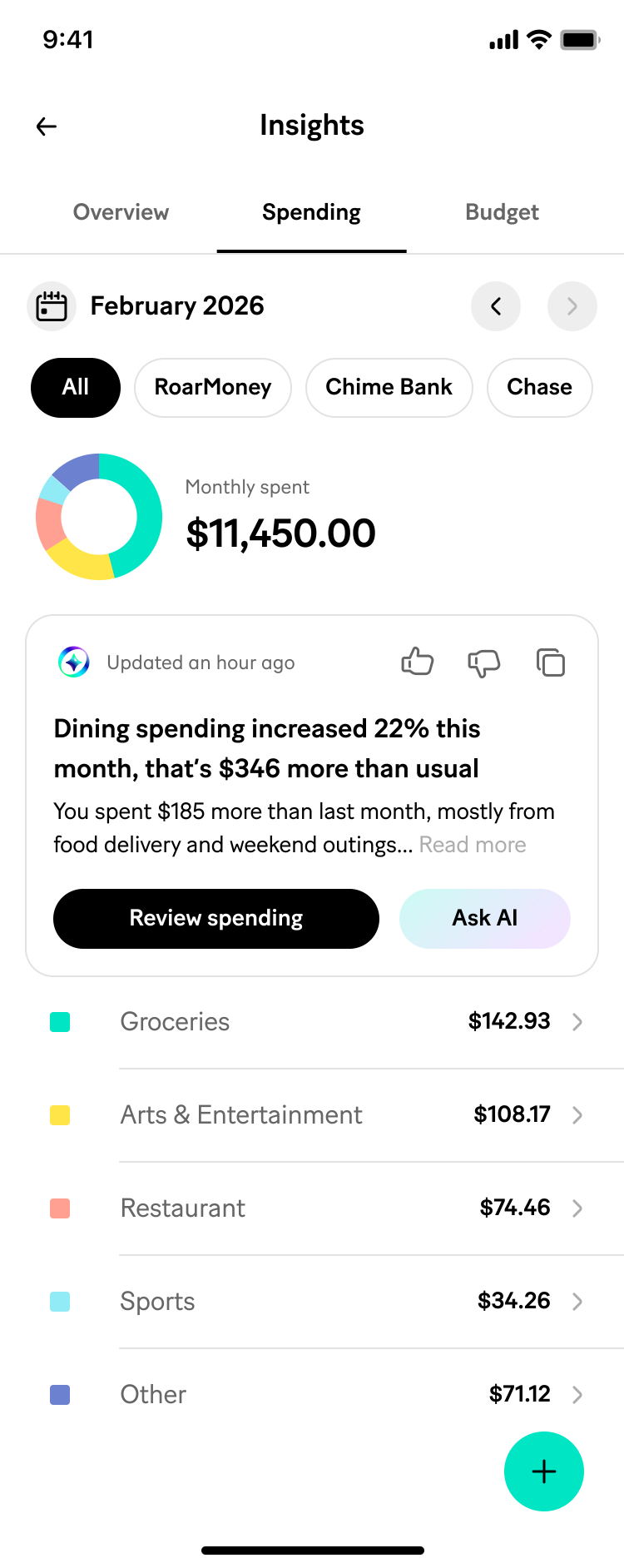
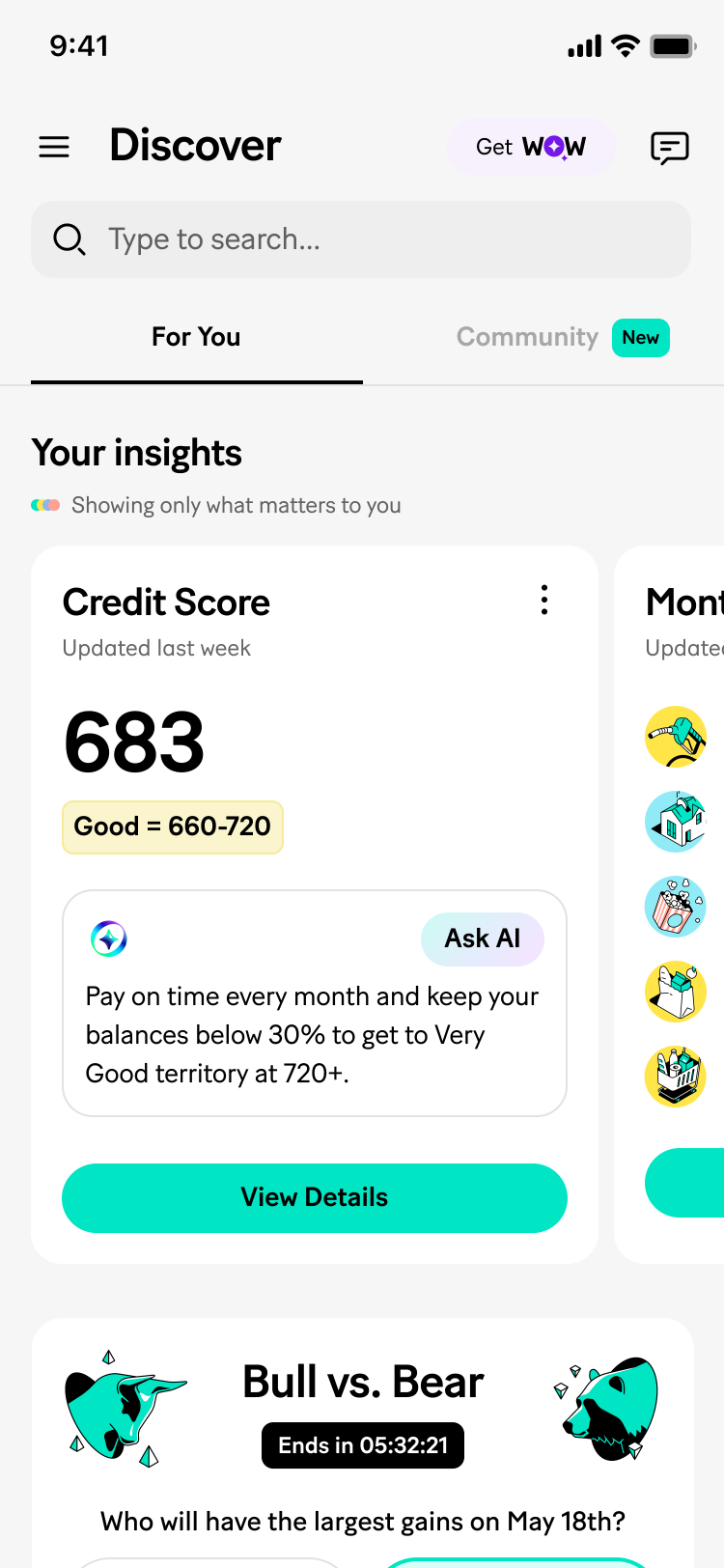
Cross-team implementation of shared system
5
Designed the Expanded Embed to adapt across content and system states, not just one ideal case
1
The most widely used variant needed to hold up under real conditions, not just the happy path. Rather than designing one fixed layout, I mapped the full range of states it actually needs to handle:
- Content length variants: full view down to 3-sentence body only, degrades gracefully whatever length the AI generates
- Data freshness variants: with label, without, or without + feedback prompt, since not every surface guarantees a timestamp
- Action variants: title + Ask AI, feedback + title + Ask AI, feedback + primary button, or body text only, flexing to what the surface supports
- System states: loading and generic error as first-class states, not afterthoughts
Treating this as one adaptable component with a defined state space, rather than a single fixed design, meant any team adopting the Expanded Embed inherited the same resilience without having to design their own loading or error handling from scratch.
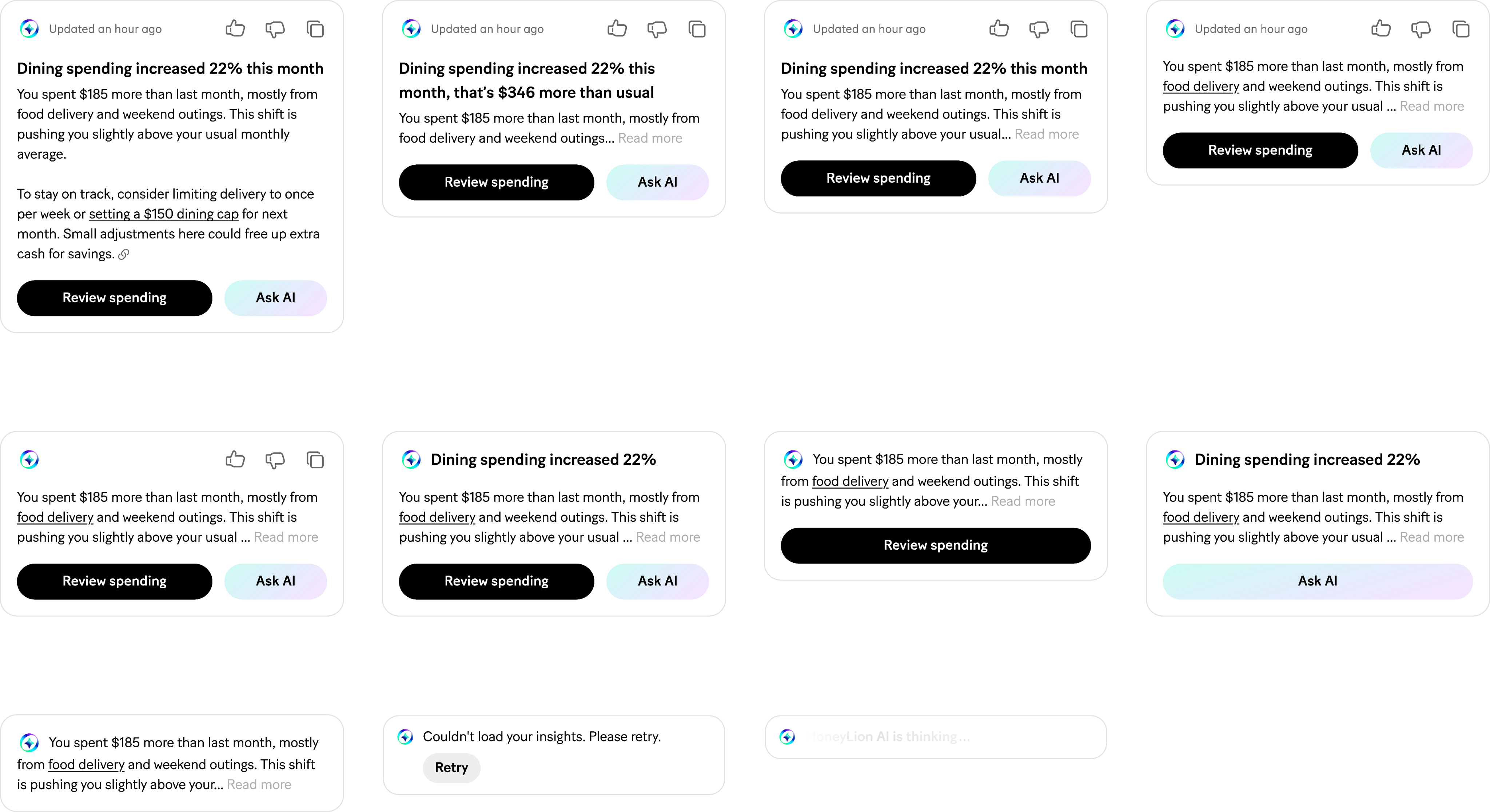
Adaptable component for different team’s use case
🎉 Final Design
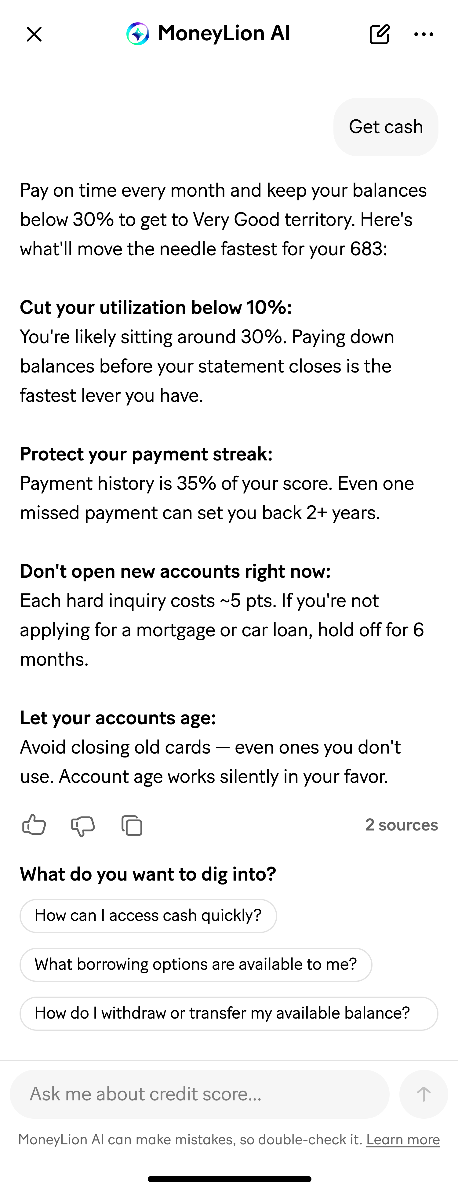

MoneyLion AI components
Impact
Adoption by the other teams whose fragmented work motivated this project, and whether drawer-mode chat held up as the right pattern versus a full navigation, aren't captured in my notes yet — both would be the strongest evidence this actually solved the cross-team fragmentation problem it started from.
What's documented: the three-variant structure (Small / User-Initiate / Expanded) became the shared reference for AI embed placement across the transaction detail, insights, and discover surfaces, replacing what had been independent, team-by-team decisions.
Key learnings & takeaways
The system didn't start as a top-down spec, it started as an audit of what different teams were already doing, and the three-variant structure came from actually naming the differences that already existed rather than inventing new ones. Choosing drawer-mode chat as an explicit experiment, rather than assuming a full chat screen was the obvious answer, kept the org honest about how new this territory still is.
- End, thank you for reading! -